
'%3e%3cpath%20d='m222.077%2039.192-8.019%20125.923-76.671-165.115zm-53.105%20162.825-57.933%2033.056-57.934-33.056%2011.783-28.556h92.301zm-57.933-139.342%2030.357%2073.803h-60.715zm-103.102%20102.44-7.937-125.923%2084.69-39.192z'%20fill='url(%23a)'/%3e%3cpath%20d='m222.077%2039.192-8.019%20125.923-76.671-165.115zm-53.105%20162.825-57.933%2033.056-57.934-33.056%2011.783-28.556h92.301zm-57.933-139.342%2030.357%2073.803h-60.715zm-103.102%20102.44-7.937-125.923%2084.69-39.192z'%20fill='url(%23b)'/%3e%3c/g%3e%3c/svg%3e)
Using Web Components in Angular Forms with Element Internals
Cory Rylan
- 4 minutes
Web Components provide a native component model for UI components. In addition, web Components encapsulate several stand-alone APIs such as Custom Elements, Shadow DOM for CSS encapsulation, slots for content projection, and Element Internals for accessibility and form participation. In this post, we will see how a basic text input Web Component can be used inside an Angular form using the Reactive Forms API.
By default, when creating a Web Component with Shadow DOM, the HTML, CSS, and ID attributes are all encapsulated to that element's shadow root. The shadow root ensures styles and id attributes are no longer global, making maintenance much easier but also means native inputs are not accessible to any code outside of the element.
Using the Element Internals API, we can enable our Web Components to participate or enable native form control support. This API allows us to have encapsulated styles and behaviors while enabling consumers of our components to use them just like any other form control.
Form Associated Custom Elements
Using the new Element Internals API, we can register our custom elements to a form element so our component can interact with the form providing form data and validation.
export class MyControl extends HTMLElement {
  #internals = this.attachInternals();

  static formAssociated = true;

  constructor() {
    super();
    this.attachShadow({ mode: 'open', delegatesFocus: true });
    this.shadowRoot.innerHTML = `
      <style>
        input {
          box-sizing: border-box;
          padding: 4px 12px;
          border: 2px solid #2d2d2d;
          border-radius: 24px;
          width: 100%;
        }
      </style>
      <input type="text" />`;
  }
}

customElements.define('my-control', MyControl);
Our component has two particular lines that enable form participation. First is the #internals = this.attachInternals(). The attachInternals call enables a suite of APIs for our component to access, allowing it to use features native HTML Elements use. This includes behaviors for accessibility, CSS custom states and forms.
Next is the static call static formAssociated = true. This line enables a set of APIs for our component to access and use for forms. Our template encapsulates some styles and a native input. This input, however, is not accessible, but with the Element Internals, the my-control element now has the basics needed for implementing form controls, just like the native input.
To enable the basic value and validation logic, we need to add additional setters/getters to consumers of my-control can treat it just like any other input type.
export class MyControl extends HTMLElement {
  #internals = this.attachInternals() as any;
  #input: HTMLInputElement;

  static formAssociated = true;

  static observedAttributes = ['disabled', 'placeholder'];

  get form() { return this.#internals.form; }
  get name() { return this.getAttribute('name')};
  get type() { return this.localName; }
  get value() { return this.#input.value; }
  set value(v) { this.#input.value = v; }
  get validity() { return this.#internals.validity; }
  get validationMessage() { return this.#internals.validationMessage; }
  get willValidate() { return this.#internals.willValidate; }

  constructor() {
    super();
    this.attachShadow({ mode: 'open', delegatesFocus: true });
    this.shadowRoot.innerHTML = `
      <style>
        input {
          box-sizing: border-box;
          padding: 4px 12px;
          border: 2px solid #2d2d2d;
          border-radius: 24px;
          width: 100%;
        }
      </style>
      <input type="text" />`;

    this.#input = this.shadowRoot.querySelector('input');
    this.#input.addEventListener('input', () => this.#internals.setFormValue(this.value));
  }

  checkValidity() { return this.#internals.checkValidity(); }

  reportValidity() { return this.#internals.reportValidity(); }

  attributeChangedCallback(name, _oldValue, newValue) { this.#input[name] = newValue; }
}

customElements.define('my-control', MyControl);
Now, this component just scratches the surface of what is possible for a robust form-based Web Component. However, this is enough for our primary use case of integrating into Angular.
Within our Angular component, we can create a Form with reactive forms and access my-control just like any other input.
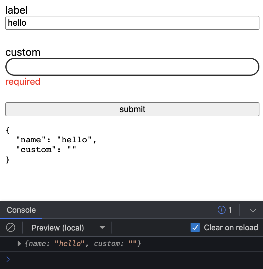
<form [formGroup]="form" (ngSubmit)="submit()">
  <label for="name">label</label>
  <input formControlName="name" id="name" />

  <label for="custom">custom</label>
  <my-control formControlName="custom" id="custom" ngDefaultControl></my-control>
  <div class="error" *ngIf="form.controls.custom.invalid && (form.controls.custom.dirty || form.controls.custom.touched)">required</div>

  <button>submit</button>
</form>
import { Component } from '@angular/core';
import { FormBuilder, FormGroup, Validators } from '@angular/forms';
@Component({
selector: 'my-app',
templateUrl: './app.component.html',
styleUrls: [ './app.component.css' ]
})
export class AppComponent {
form: FormGroup;
constructor(private formBuilder: FormBuilder) {
this.form = this.formBuilder.group({
name: ['hello'],
custom: ['', Validators.required]
});
}
submit() {
this.form.controls.custom.markAsTouched();
console.log(this.form.value);
}
}
Angular Compatibility Issues
One essential line to call out is on the my-control tag in our Angular template.
<my-control formControlName="custom" id="custom" ngDefaultControl></my-control>Note the ngDefaultControl directive. This directive tells the Angular form API to treat this element tag as a standard string text input. With this, the Angular forms API will fully work with your custom element. You can attach this directive automatically by creating a global directive that uses the my-control tag name.
Also, note the ngDefaultControl only works with string value types. Form inputs, including Web Components, can have other types such as number, boolean and date. If you are interested in Angular adding support for this, I recommend opening an issue or commenting/upvoting this PR Add explicit selectors for all built-in ControlValueAccessors.
Another possible workaround is providing directives that extend the internal Control Value Accessors to enable Angular Forms to be compatible with other control types.
import { CUSTOM_ELEMENTS_SCHEMA, Directive, forwardRef, NgModule } from '@angular/core';
import { BrowserModule } from '@angular/platform-browser';
import { CheckboxControlValueAccessor, DefaultValueAccessor, NG_VALUE_ACCESSOR, RadioControlValueAccessor, ReactiveFormsModule } from '@angular/forms';

@Directive({ selector: 'ui-radio', providers: [{ provide: NG_VALUE_ACCESSOR, useExisting: forwardRef(() => UIRadio), multi: true }] })
export class UIRadio extends RadioControlValueAccessor { }

@Directive({ selector: 'ui-checkbox', providers: [{ provide: NG_VALUE_ACCESSOR, useExisting: forwardRef(() => UICheckbox), multi: true }] })
export class UICheckbox extends CheckboxControlValueAccessor { }

@Directive({ selector: 'ui-input', providers: [{ provide: NG_VALUE_ACCESSOR, useExisting: forwardRef(() => UIInput), multi: true }] })
export class UIInput extends DefaultValueAccessor { }

@NgModule({
  imports: [BrowserModule, ReactiveFormsModule],
  declarations: [AppComponent, UIRadio, UICheckbox, UIInput],
  bootstrap: [AppComponent],
  schemas: [CUSTOM_ELEMENTS_SCHEMA]
})
export class AppModule { }
Each Web Component ui-checkbox, ui-input, and ui-radio implement their respective form control input types. The Value Accessor directives enable Angular Forms to treat them as the native checkbox, input, and radio inputs. You can find how this works internally in Angular forms here.
I highly recommend checking out "More capable form controls" on web.dev for a deep dive into how to build your own Web Component form inputs. You can check out the working demo in the link below!


%20--%3e)
%20--%3e)
