

Reusable Component Patterns - Default Slots
Cory Rylan
- 3 minutes
When building reusable Web Components, it's important to consider how developers will use them in various contexts. One common challenge is providing reasonable defaults that work for most use cases, while still allowing customization when necessary.
For example, imagine an alert message component that can display different status states, such as success, warning, and danger.
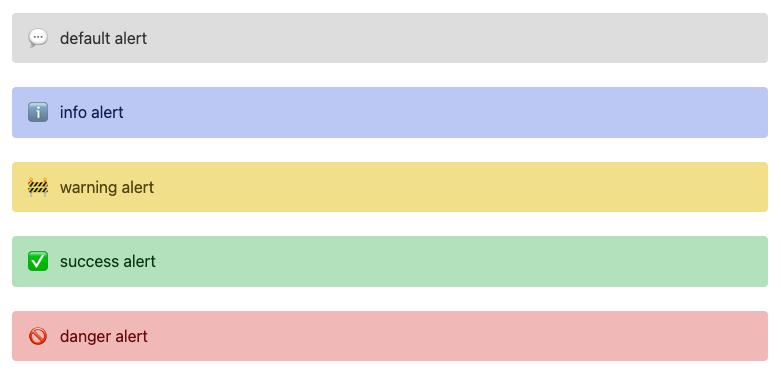
<ui-alert>default alert</ui-alert>
<ui-alert status="info">info alert</ui-alert>
<ui-alert status="success">success alert</ui-alert>
<ui-alert status="warning">warning alert</ui-alert>
<ui-alert status="danger">danger alert</ui-alert>
Each state may require a different icon to be displayed within the alert message. By default, the component can provide its own set of icons for each status state, but this may not be sufficient for all use cases.

One approach to address this challenge is to use the Shadow DOM feature Slots, which allow developers to customize or project content into specific parts of a component's template without having to modify the component's implementation.
With default slots, the alert component can internally provide default icons for different status states, while still allowing developers to customize the icons as needed. Here's an example of how this could be implemented:
<!-- ui-alert template -->
<slot name="icon">
  <ui-icon name=${this.status}></ui-icon>
</slot>
The above code defines a default slot named "icon" within the alert component's template. It uses JavaScript template literals to dynamically set the name of the icon based on the status of the alert.
Developers can then use this slot to project their own icon into the alert component, overriding the default icon:
<!-- API usage -->
<ui-alert>
  <span slot="icon">🎉</span>
  custom icon alert
</ui-alert>
In the above example, the developer is passing a custom icon to the alert component using the icon slot. The component will render this custom icon instead of the default icon for the "warning" status state.
By using default slots, we can mitigate the risk of tightly coupled APIs and maintain a clear separation of concerns between the alert and icon elements. It also allows developers to have full control over the custom icon without the alert element needing to expose the icon through a series of inherited attributes and properties.
As with all API design choices, there are tradeoffs involved and it's important to consider the benefits and potential challenges of each approach. However, using default slots is a powerful technique for building reusable components that provide reasonable defaults while also allowing for customization when necessary. Check out the full working demo below!


%20--%3e)
%20--%3e)
