
'%3e%3cpath%20d='m222.077%2039.192-8.019%20125.923-76.671-165.115zm-53.105%20162.825-57.933%2033.056-57.934-33.056%2011.783-28.556h92.301zm-57.933-139.342%2030.357%2073.803h-60.715zm-103.102%20102.44-7.937-125.923%2084.69-39.192z'%20fill='url(%23a)'/%3e%3cpath%20d='m222.077%2039.192-8.019%20125.923-76.671-165.115zm-53.105%20162.825-57.933%2033.056-57.934-33.056%2011.783-28.556h92.301zm-57.933-139.342%2030.357%2073.803h-60.715zm-103.102%20102.44-7.937-125.923%2084.69-39.192z'%20fill='url(%23b)'/%3e%3c/g%3e%3c/svg%3e)
Theming Angular apps with CSS Custom Properties
Theming Angular apps has never been easier using CSS Custom Properties. CSS Custom Properties allow us to define our own custom variables for CSS values that we can share between components and style rules.
A common use case for using Sass or Less variables is to make it easy to change the value in one place and have it propagate to all CSS rules. CSS Custom Properties work the same way but also allow us to change the value at runtime. Updating CSS Custom Properties at runtime open up the opportunity to easily create themes for our Angular application.
In our use case, we will have two themes, first a default light theme and second and optional default theme.
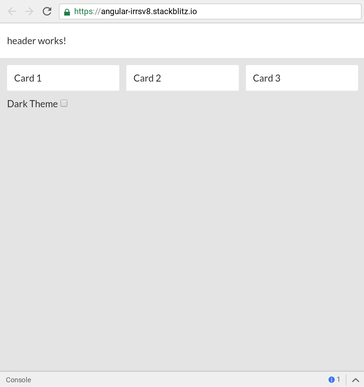
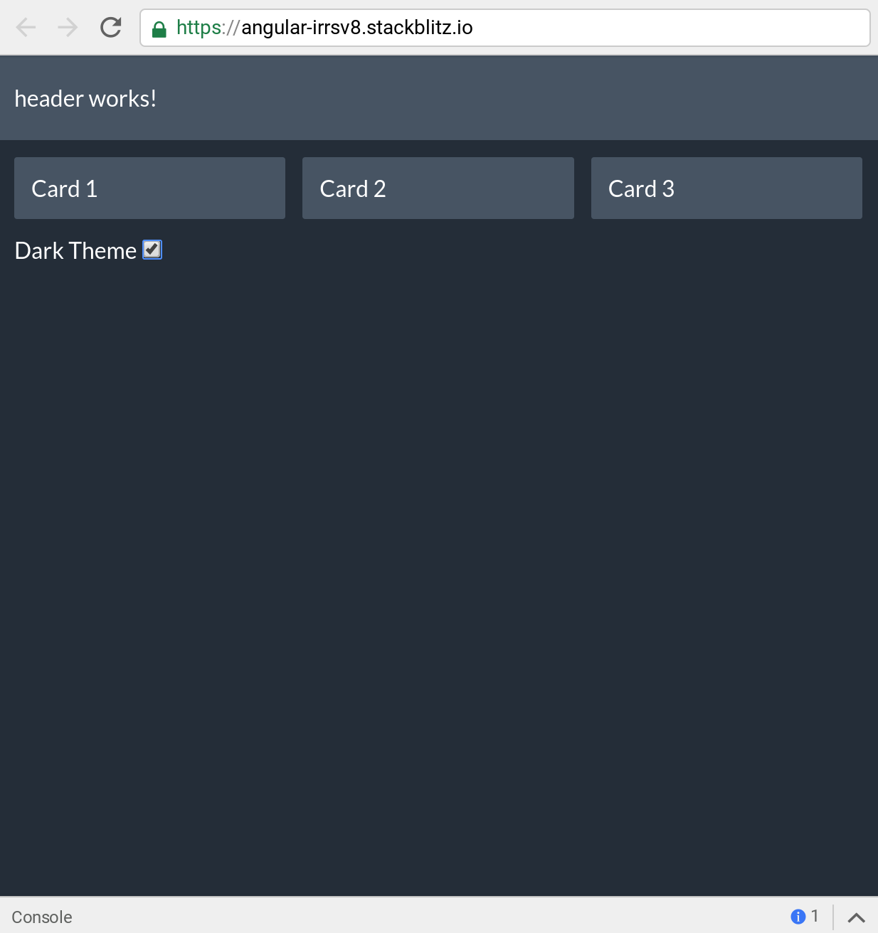
In our Angular app, we have some default global styles as well as component level styles. This app will have two components, a header, and card component. Both of these components will use CSS variables (custom properties) to update their values dynamically. First, let's take a look at the app component template.
<app-header></app-header>

<main>
  <section>
    <app-card>
      Card 1
    </app-card>
    <app-card>
      Card 2
    </app-card>
    <app-card>
      Card 3
    </app-card>
  </section>

  <label for="darkTheme">Dark Theme</label>
  <input id="darkTheme" type="checkbox" [formControl]="darkTheme" />
</main>
In our template, we have our header and card components. The template also has a single checkbox we will use to toggle our theme. Next, let's take a look at the TypeScript of our app component.
import { Component } from '@angular/core';
import { FormControl } from '@angular/forms';

import { ThemeService } from './theme.service';

@Component({
  selector: 'my-app',
  templateUrl: './app.component.html',
  styleUrls: ['./app.component.css']
})
export class AppComponent {
  darkTheme = new FormControl(false);

  constructor(private themeService: ThemeService) {
    this.darkTheme.valueChanges.subscribe(value => {
      if (value) {
        this.themeService.toggleDark();
      } else {
        this.themeService.toggleLight();
      }
    });
  }
}
In our component, we have a single FormControl. We subscribe to the value changes when the user selects the checkbox. We have a theme service that will be responsible for toggling between the different CSS themes. Before we jump into our theme service lets take a look at our global.css file.
CSS Custom Properties
In our global.css file we define the CSS Custom Properties we want to share application wide.
:root {
  --primary-color: #fff; // white
  --background-color: #e5e5e5; // light grey
  --text-color: #2d2d2d; // dark grey
}
In our global.css file we have our CSS custom properties defined in a :root selector. The root selector at the global level will allow us to define the custom properties on the entire document globally. Global variables in CSS will enable us to define theme variables that multiple components can use. To define a CSS custom property, we must prefix the property key with two dashes like the following --primary-color: #fff;. We can now reference the variable we defined in other CSS rules.
:root {
  --primary-color: #fff;
  --background-color: #e5e5e5;
  --text-color: #2d2d2d;
}

body {
  background-color: var(--background-color);
  color: var(--text-color);
  font-family: Lato;
  padding: 0;
  margin: 0;
}
To use a custom property, we use the var keyword to pass in a reference to the custom property. In our example above we can set the body background and text colors to our defined custom properties. Next, we will look at our app-card component and how it uses our CSS variables.
Component CSS
Our first Angular component, the card component is relatively simple using ng-content to allow use to pass HTML content into the inner template.
import { Component } from '@angular/core';

@Component({
  selector: 'app-card',
  styleUrls: ['./card.component.css'],
  template: `
    <ng-content></ng-content>
  `
})
export class CardComponent {}
Let's now take a look at the CSS for the card component.
:host {
  display: block;
  padding: 12px;
  border-radius: 2px;
  background-color: var(--primary-color);
  color: var(--text-color);
}
The first style on the app-card component uses the :host selector. The :host selector will style the host element of our component. The host element is the element that is created for the component, so in our use case that will be app-card. We have some basic styles such as display, padding, and border-radius. Our card now uses our CSS Custom Properties we defined with the :root selector.
background-color: var(--primary-color);
color: var(--text-color);
We can see to use our CSS Custom Properties we use the var syntax. Now whenever we change the value of one of these properties in our application the card will reflect those changes. Next, let's take a look at the header component.
import { Component } from '@angular/core';

@Component({
  selector: 'app-header',
  template: `
    <p>
      header works!
    </p>
  `,
  styleUrls: ['./header.component.css']
})
export class HeaderComponent {}
Our app-header component is very basic so let's jump to the styles.
:host {
  display: block;
  padding: 4px 12px;
  background-color: var(--primary-color);
  color: var(--text-color);
}
Similar to our app-card component we can see the header references our two properties, --primary-color and --text-color. Now that we see how our Angular components use the CSS Custom Properties how do we update them? Next, we will look at the Theme Service we used earlier to toggle between the light and dark themes.
Theme Service
Our theme service is an Angular service that we have created to abstract out the logic for toggling the CSS Custom Properties. First, how do we set a CSS Custom Property from JavaScript?
document.documentElement.style.setProperty('--primary-color', '#455363');Using JavaScript, we can easily set any custom property key and value. Our Angular Theme Service simply abstracts this into a single place for our App component to toggle.
import { Injectable } from '@angular/core';

export const darkTheme = {
  'primary-color': '#455363',
  'background-color': '#1f2935',
  'text-color': '#fff'
};

export const lightTheme = {
  'primary-color': '#fff',
  'background-color': '#e5e5e5',
  'text-color': '#2d2d2d'
};

@Injectable({ providedIn: 'root' })
export class ThemeService {
  toggleDark() {
    this.setTheme(darkTheme);
  }

  toggleLight() {
    this.setTheme(lightTheme);
  }

  private setTheme(theme: {}) {
    Object.keys(theme).forEach(k =>
      document.documentElement.style.setProperty(`--${k}`, theme[k])
    );
  }
}
Using Angular Components, Services and Custom CSS Properties we can quickly build out robust themable applications for our users. Check out the full working demo below!


%20--%3e)
%20--%3e)
