
'%20points='107.644,470.877%2074.633,100.62%20437.367,100.62%20404.321,470.819%20255.778,512'/%3e%3cpolygon%20fill='hsl(18,%2086%25,%2055%25)'%20points='256,480.523%20376.03,447.246%20404.27,130.894%20256,130.894'/%3e%3cg%3e%3cpolygon%20fill='%23EBEBEB'%20points='256,268.217%20195.91,268.217%20191.76,221.716%20256,221.716%20256,176.305%20255.843,176.305%20142.132,176.305%20143.219,188.488%20154.38,313.627%20256,313.627'/%3e%3cpolygon%20fill='%23EBEBEB'%20points='256,386.153%20255.801,386.206%20205.227,372.55%20201.994,336.333%20177.419,336.333%20156.409,336.333%20162.771,407.634%20255.791,433.457%20256,433.399'/%3e%3c/g%3e%3cg%3e%3cpath%20d='M108.382,0h23.077v22.8h21.11V0h23.078v69.044H152.57v-23.12h-21.11v23.12h-23.077V0z'/%3e%3cpath%20d='M205.994,22.896h-20.316V0h63.72v22.896h-20.325v46.148h-23.078V22.896z'/%3e%3cpath%20d='M259.511,0h24.063l14.802,24.26L313.163,0h24.072v69.044h-22.982V34.822l-15.877,24.549h-0.397l-15.888-24.549v34.222%20h-22.58V0z'/%3e%3cpath%20d='M348.72,0h23.084v46.222h32.453v22.822H348.72V0z'/%3e%3c/g%3e%3cg%3e%3cpolygon%20fill='%23FFFFFF'%20points='255.843,268.217%20255.843,313.627%20311.761,313.627%20306.49,372.521%20255.843,386.191%20255.843,433.435%20348.937,407.634%20349.62,399.962%20360.291,280.411%20361.399,268.217%20349.162,268.217'/%3e%3cpolygon%20fill='%23FFFFFF'%20points='255.843,176.305%20255.843,204.509%20255.843,221.605%20255.843,221.716%20365.385,221.716%20365.385,221.716%20365.531,221.716%20366.442,211.509%20368.511,188.488%20369.597,176.305'/%3e%3c/g%3e%3c/g%3e%3c/g%3e%3c/switch%3e%3c/svg%3e)
Styling HTML Form Validation with CSS
HTML form validation is a powerful feature that helps users fill out forms correctly. When a user submits a form, the browser will automatically validate the form fields and display error messages if the form is invalid. These error messages are displayed by the browser and are not customizable by default. In this blog post, we will explore how to create custom form validation styles using only CSS.
HTML Validation
HTML form validation is a feature that is built into all modern browsers. When a user submits a form, the browser can automatically validate the form fields based on the input type and provided attributes. For example, if a user enters an invalid email address in an email input field, the browser will display an error message indicating that the email address is invalid.
<form>
<label for="email">email</label>
<input type="email" id="email" name="email" required />
<button type="submit">Submit</button>
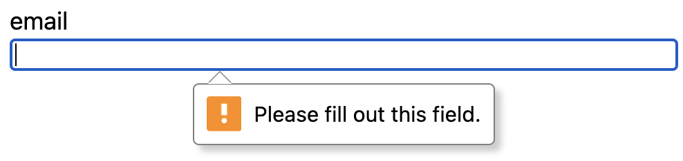
</form>In this example, we have a simple form with an email input field that is required. When the user submits the form without entering a valid email address, the browser will display an error message indicating that the email address is required.
Native Validation States in CSS
HTML form elements have built-in validation states that can be styled using CSS. The :valid and :invalid states can be used to style form elements based on their validation status. For example, you can change the border color of an input field when it is invalid by using the following CSS:
input:invalid {
  border-color: red;
}
However the :invalid selector is active even when the user has not interacted with the form control. This can be confusing for users as they may see error messages before they have even attempted to fill out the form. To avoid this, you can use the newer CSS pseudo-classes :user-invalid and :user-valid which only apply when the user has interacted with the form control.
input:user-invalid {
  border-color: red;
}
Custom Validation Messages
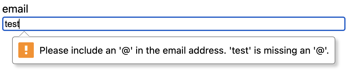
The native forms API can provide baseline validation messages for form fields. Example for an email input field with a incorrect email format we see the following:
We can customize the validation message using setting novalidate on the form element and some custom CSS. For example, we can display a custom inline error message when the user has not entered a valid email address:
<fieldset>
  <label for="email">email</label>
  <input type="email" id="email" name="email" required />
  <span aria-live="polite">valid email required</span>
</fieldset>
Using the CSS :user-invalid pseudo-class, we can combine it with the CSS :has selector to display custom inline error messages when a form field is invalid.
[aria-live='polite'] {
  color: red;
  font-size: 12px;
  display: none;
}

fieldset:has(:user-invalid) {
  input {
    border: 2px solid red;
  }

  [aria-live='polite'] {
    display: block;
  }
}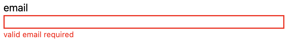
In this example, we leverage the :has selector to target the fieldset element when it has a invalid form field. We then use the aria-live attribute to show a custom error message when the user has not entered a valid email address.
Conclusion
By using the :user-invalid pseudo-class and the :has selector, you can create custom error messages for form fields. HTML form validation combined with these newer CSS features can help improve the UX of forms without requiring heavy JavaScript based solutions. Check out the full working demo below!


%20--%3e)
%20--%3e)
