

CSS Interaction Theming with Accent Color and Color Contrast
Cory Rylan
- 4 minutes
Theming in CSS has improved quite a bit in the past few years. CSS Custom Properties introduced true dynamic theming to the Web. New features recently have shipped or are being proposed that can take theming even further.
Features such as color-scheme allow us or the user to define preferences such as dark themes or high contrast modes in the browser. This immediately improves the default native controls when switching to color-scheme: dark.
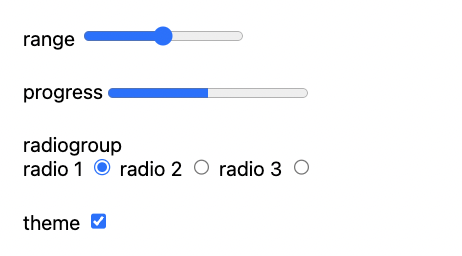
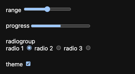
The accent-color property makes color customizations across native controls easy and with only one line of CSS. The benefit of accent-color is the browser can automatically generate the various color states and contrasts based on the single color provided. This ensures a consistent and accessible experience for users and reduces a lot of custom CSS from having to be created.
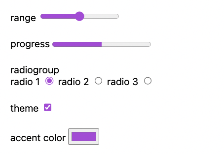
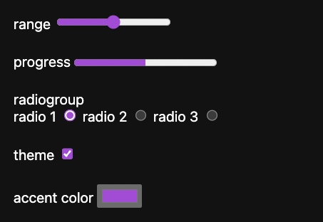
Now while accent-color and color-scheme helps customize native controls easier, it doesn't help us with custom components or elements we want to customize, like buttons.
Typically, when styling interaction states on buttons, we adjust the element's background color based on the state.
button {
  background: gray;
}

button:hover {
  background: lightgray;
}

button:hover {
  background: darkgray;
}
Reassigning the background colors, however, introduces a lot of maintenance. In addition, for each color of an interactive element, we have several potential interaction states, default, hover, active, selected, and disabled. Then if we add theming, this further complicates the number of color values we have to define.
Secondary Background Color with CSS Background Image
Leveraging the CSS background-image property, we can create a "secondary" background color that we can adjust based on the current state.
button {
  background: blue;
  background-image: linear-gradient(hsla(0, 0%, 0%, 0.5) 0 0);
}
Using HSLA, we can adjust the alpha value of either black to darken or white to lighten the background color. The benefit to this over CSS filter/brighten is that it only changes the background color and preserves the original text color.
button:hover {
  background-image: linear-gradient(hsla(0, 0%, 0%, 0.1) 0 0);
}

button:active {
  background-image: linear-gradient(hsla(0, 100%, 100%, 0.1) 0 0);
}
With the CSS background-image we can easily adjust the "interaction" layer without redefining new colors. We can abstract this into a more generic solution via CSS Custom Properties.
:root {
  --interaction: 0;
  --interaction-hover: 0.1;
  --interaction-active: 0.1;
}

[interaction] {
  background-image: linear-gradient(hsla(0, 0%, 0%, var(--interaction)) 0 0);
}

[interaction]:hover {
  background-image: linear-gradient(hsla(0, 0%, 0%, var(--interaction-hover)) 0 0);
}

[interaction]:active {
  background-image: linear-gradient(hsla(0, 100%, 100%, var(--interaction-active)) 0 0);
}
Now we can adjust our accent color and alpha value with CSS custom properties and automatically create new visual interaction states.
CSS Color Contrast
We can dynamically change the background color now with our interactions; however, this only partially fixes some of the issues. For example, if our background color is too light, we may lose the contrast needed for our text.
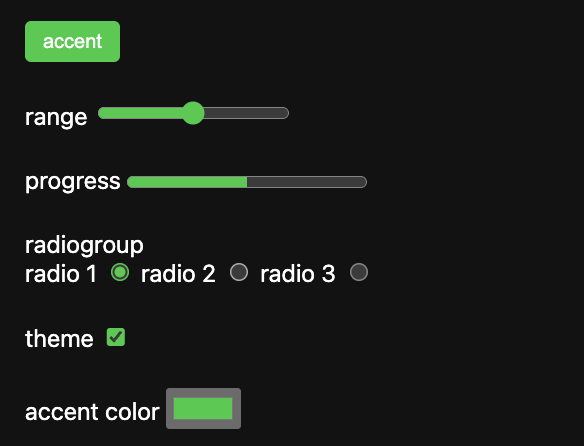
Notice in Chrome, the checkmark is now dark relative to the background green of our checkbox. When using the CSS accent-color the browser will automatically switch the text/foreground color to the appropriate contrast. However, for our button, the contrast is broken. Unfortunately, there has yet to be an easy cross-browser solution for this. Luckily there is a new CSS spec, color-contrast which can provide this automatic contrast checking.
button {
  color: color-contrast(#5fca49 vs #fff, #000);
}
The color-contrast function takes a base color and a list of color values to compare. The browser will determine which color provides the appropriate contrast for the background and assign that color. This feature gives us the native functionality that browsers internally have today.
With Safari Technical Preview, you can enable CSS color-contrast behind the experimental flag.
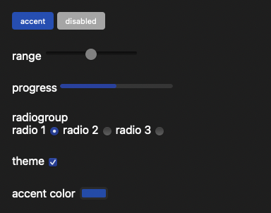
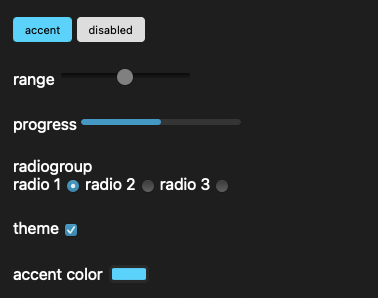
Now with any accent color, we choose the text color that will automatically adjust to the best contrast level.
With accent-color and hopefully the adoption of color-contrast automatic and configurable interactions, styles are making theming in CSS easier than ever. Hopefully, future API proposals will enable us to leverage the internals of the accent-color feature for custom elements without the need for workarounds like background-image. Check out the full demo below!


%20--%3e)
%20--%3e)
'%20points='107.644,470.877%2074.633,100.62%20437.367,100.62%20404.321,470.819%20255.778,512'/%3e%3cpolygon%20fill='hsl(18,%2086%25,%2055%25)'%20points='256,480.523%20376.03,447.246%20404.27,130.894%20256,130.894'/%3e%3cg%3e%3cpolygon%20fill='%23EBEBEB'%20points='256,268.217%20195.91,268.217%20191.76,221.716%20256,221.716%20256,176.305%20255.843,176.305%20142.132,176.305%20143.219,188.488%20154.38,313.627%20256,313.627'/%3e%3cpolygon%20fill='%23EBEBEB'%20points='256,386.153%20255.801,386.206%20205.227,372.55%20201.994,336.333%20177.419,336.333%20156.409,336.333%20162.771,407.634%20255.791,433.457%20256,433.399'/%3e%3c/g%3e%3cg%3e%3cpath%20d='M108.382,0h23.077v22.8h21.11V0h23.078v69.044H152.57v-23.12h-21.11v23.12h-23.077V0z'/%3e%3cpath%20d='M205.994,22.896h-20.316V0h63.72v22.896h-20.325v46.148h-23.078V22.896z'/%3e%3cpath%20d='M259.511,0h24.063l14.802,24.26L313.163,0h24.072v69.044h-22.982V34.822l-15.877,24.549h-0.397l-15.888-24.549v34.222%20h-22.58V0z'/%3e%3cpath%20d='M348.72,0h23.084v46.222h32.453v22.822H348.72V0z'/%3e%3c/g%3e%3cg%3e%3cpolygon%20fill='%23FFFFFF'%20points='255.843,268.217%20255.843,313.627%20311.761,313.627%20306.49,372.521%20255.843,386.191%20255.843,433.435%20348.937,407.634%20349.62,399.962%20360.291,280.411%20361.399,268.217%20349.162,268.217'/%3e%3cpolygon%20fill='%23FFFFFF'%20points='255.843,176.305%20255.843,204.509%20255.843,221.605%20255.843,221.716%20365.385,221.716%20365.385,221.716%20365.531,221.716%20366.442,211.509%20368.511,188.488%20369.597,176.305'/%3e%3c/g%3e%3c/g%3e%3c/g%3e%3c/switch%3e%3c/svg%3e)