

CSS Encapsulation with Angular Components
CSS encapsulation has always been something developers have wanted in their web applications. The ability to scope CSS to a specific component without affecting other components has been difficult to achieve. This post we will cover how to use Angular components to encapsulate our CSS and learn the pros and cons to each technique.
In our Angular app we will have three components. First is our App component, it will have two child components FirstComponent and SecondComponent.

import { Component } from '@angular/core';

@Component({
  selector: 'demo-app',
  template: `
    <h3>CSS Encapsulation with Angular</h3>
    <div class="cmp">
      App Component
      <first-cmp></first-cmp>
      <second-cmp></second-cmp>
    </div>
  `
})
export class App {
  constructor() {}
}
We link a separate style sheet into our index.html that has a single global style rule that will be applied to any element with the CSS class of cmp.
.cmp {
  padding: 6px;
  margin: 6px;
  border: 2px solid red;
}
Style Techniques
Now lets take a look at our FirstComponent and SecondComponent and see the options we have to style these components.
import { Component } from '@angular/core';

@Component({
  selector: 'first-cmp',
  template: `
    <div class="cmp">First Component</div>
    <style>
      .cmp {
        border: blue 2px solid;
      }
    </style>
  `
})
export class FirstComponent {
  constructor() {}
}

@Component({
  selector: 'second-cmp',
  template: `
    <div class="cmp">Second Component</div>
  `,
  styles: ['.cmp { border: green 2px solid; }']
})
export class SecondComponent {
  constructor() {}
}
So looking at our two components there are two different ways to apply styles to them. In FirstComponent we have a style tag in out template while in the SecondComponent we can use a styles property on our component decorator. Both will have the same outcome when rendering to the screen.
View Encapsulation
Angular by default encapsulates component CSS. So lets take a look at the rendered output of our code so far.
So we can see that each components corresponding .cmp CSS class is scoped to it's own template. The default CSS behavior multiple .cmp classes would of caused global name collisions with our styles. So lets look at the Chrome dev tools and see what the rendered HTML and CSS looks like.
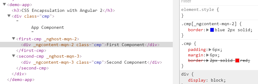
By default Angular generates attributes to help scope our CSS class names to our given component. So you can see here all elements inherit the .cmp CSS. Each component's CSS is scoped and overrides our base border color. The attributes generated by Angular should NOT be used to target elements with CSS. These attributes are automatically generated and can change.
Native CSS encapsulation with Shadow DOM
Angular has some additional CSS rendering options. The first is we can use Native CSS encapsulation. Turning on this feature will force browsers to use the Shadow DOM. For browsers that understand the Shadow DOM this creates a new rendering context for a given element that is completely isolated from the rest of the DOM. This is true native CSS encapsulation but is not enabled by default in Angular. So lets look at the code and the generated output.
import { Component, ViewEncapsulation } from '@angular/core';

@Component({
  selector: 'second-cmp',
  template: `
    <div class="cmp">Second Component</div>
  `,
  styles: ['.cmp { border: green 2px solid; }']
  // encapsulation: ViewEncapsulation.ShadowDom // introduced in Angular 6.1 (Shadow Dom v1)
  // encapsulation: ViewEncapsulation.Native // deprecated in Angular 6.1+ (Shadow Dom v0)
})
export class SecondComponent {
  constructor() {}
}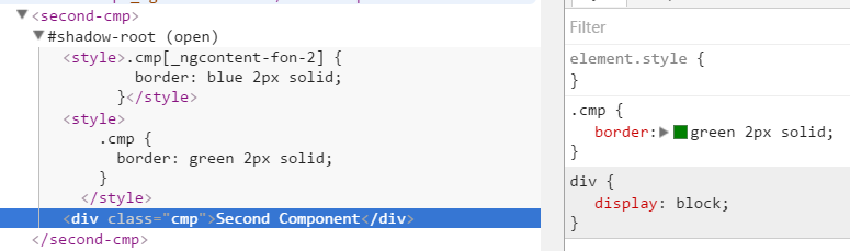
So here we can see a shadow root element being created which isolates our SecondComponent from the rest of our application. One thing to note this behavior is slightly different than the default behavior. This isolates the component completely so we do not inherit the global .cmp styles with that had our padding and margin.

If we want the default global CSS to apply to elements in the shadow DOM we must use a special CSS selector.
::shadow .cmp {
  padding: 6px;
  margin: 6px;
}
Disable CSS Encapsulation
Sometimes although rare, there are occasions where we would like a component's CSS to not be encapsulated and apply globally to our application. Angular offers an easy way to disable CSS encapsulation. So lets disable this on our SecondComponent.
import { Component, ViewEncapsulation } from '@angular/core';

@Component({
  selector: 'second-cmp',
  template: `
    <div class="cmp">Second Component</div>
  `,
  styles: ['.cmp { border: green 2px solid; }'],
  encapsulation: ViewEncapsulation.None // Use to disable CSS Encapsulation for this component
})
export class SecondComponent {
  constructor() {}
}
Now that we disabled our CSS/View Encapsulation lets look at how our app is rendered.

So we can see in our SecondComponent the .cmp CSS class set the border to green. Since encapsulation is disabled it is now applied globally. This overrides the default global of red making our root app component have a green border. Notice our FirstComponent still has a blue border. This is because our FrstComponent still has the default View Encapsulation. If CSS is needed to be shared across components create global utility classes and do not copy the CSS over and over between components.
With Angular Components we have far more control with our CSS styles. Check out the full working demo in the link below.


%20--%3e)
%20--%3e)
'%20points='107.644,470.877%2074.633,100.62%20437.367,100.62%20404.321,470.819%20255.778,512'/%3e%3cpolygon%20fill='hsl(18,%2086%25,%2055%25)'%20points='256,480.523%20376.03,447.246%20404.27,130.894%20256,130.894'/%3e%3cg%3e%3cpolygon%20fill='%23EBEBEB'%20points='256,268.217%20195.91,268.217%20191.76,221.716%20256,221.716%20256,176.305%20255.843,176.305%20142.132,176.305%20143.219,188.488%20154.38,313.627%20256,313.627'/%3e%3cpolygon%20fill='%23EBEBEB'%20points='256,386.153%20255.801,386.206%20205.227,372.55%20201.994,336.333%20177.419,336.333%20156.409,336.333%20162.771,407.634%20255.791,433.457%20256,433.399'/%3e%3c/g%3e%3cg%3e%3cpath%20d='M108.382,0h23.077v22.8h21.11V0h23.078v69.044H152.57v-23.12h-21.11v23.12h-23.077V0z'/%3e%3cpath%20d='M205.994,22.896h-20.316V0h63.72v22.896h-20.325v46.148h-23.078V22.896z'/%3e%3cpath%20d='M259.511,0h24.063l14.802,24.26L313.163,0h24.072v69.044h-22.982V34.822l-15.877,24.549h-0.397l-15.888-24.549v34.222%20h-22.58V0z'/%3e%3cpath%20d='M348.72,0h23.084v46.222h32.453v22.822H348.72V0z'/%3e%3c/g%3e%3cg%3e%3cpolygon%20fill='%23FFFFFF'%20points='255.843,268.217%20255.843,313.627%20311.761,313.627%20306.49,372.521%20255.843,386.191%20255.843,433.435%20348.937,407.634%20349.62,399.962%20360.291,280.411%20361.399,268.217%20349.162,268.217'/%3e%3cpolygon%20fill='%23FFFFFF'%20points='255.843,176.305%20255.843,204.509%20255.843,221.605%20255.843,221.716%20365.385,221.716%20365.385,221.716%20365.531,221.716%20366.442,211.509%20368.511,188.488%20369.597,176.305'/%3e%3c/g%3e%3c/g%3e%3c/g%3e%3c/switch%3e%3c/svg%3e)