

Converting CSS Pixels to Rems
Cory Rylan
- 3 minutes
CSS has many different measurement value types. While px or pixels are the most common, there are some advantages of the other available types. One of these value types is the rem. This post will see how rem works and how you can create "relative pixels" to make your Web pages more accessible and scalable.
Rem is a relative value based on the base font size of the web page. This means if your base font size changes on the page, anything using rem will scale relative to that font size.
html {
  font-size: 16px;
}

h1 {
  font-size: 1.5rem; /* 24px */
}

p {
  font-size: 1rem; /* 16px */
}
By default, the base font size on the Web is 16px. So if we use 1rem, we get a font size of about 16px. If we use a rem value of 1.5rem, then we get around 24px. So let's change the base font size to say 20px.
html {
  font-size: 20px;
}

h1 {
  font-size: 1.5rem; /* 30px */
}

p {
  font-size: 1rem; /* 20px */
}
By increasing the base font size, we also increase the scale of anything on the page using rem. This is helpful for responsive typography but also accessibility. Using rem, we can allow the user to scale the browser default font size, and our UI remains functional and scalable.
Accessibility
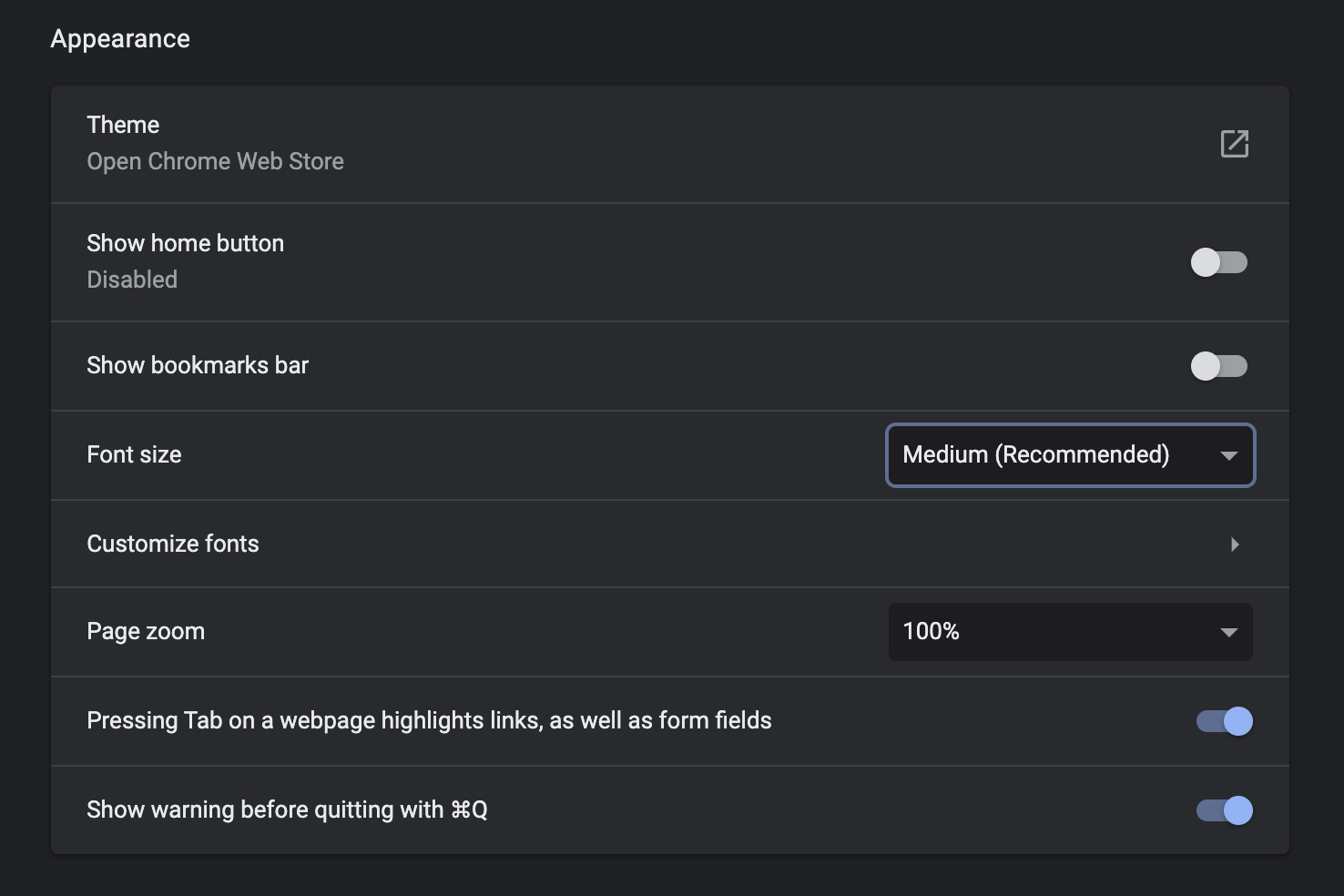
If we use px, the user cannot adjust the font size, which can be a serious issue with any vision impairments. I am not talking about browser zoom, which scales the page; I am referring to font size settings within Chrome. Go ahead and try it yourself and see how it can work great with rem but break with px.
Now thinking in rem is not always easy. For example, we could use a CSS Processing language like Sass or a tool like Post CSS to convert our px to rem. However, there is a way to accomplish this natively using CSS Custom Properties (CSS Variables).
Relative Pixels
Using CSS Custom Properties and CSS Calc, we can create dynamic rem values but express them as px variables.
html {
  font-size: calc((var(--base) / 16) * 100%);
  --r32: calc((32 / var(--base) * 1rem));
  --r24: calc((24 / var(--base) * 1rem));
  --r16: calc((16 / var(--base) * 1rem));
  --base: 16;
}

h1, h2, h3, p {
  font-weight: normal;
  margin: 0 0 var(--r24) 0;
}

p {
  font-size:16px;
}

h1 {
  font-size: var(--r32);
}

h2 {
  font-size: var(--r24);
}
We are creating a --base variable that can be used to adjust the base value calculated to create our rem value. For example, using a px value divided by the base, we can have a px percentage converted to rem by multiplying to 1rem.
So in the case of --r24, it stores the value of 24 divided by --base (16), then we convert to rem * 1rem. Now we can refer to --r24 as a "relative" pixel representing 24px in Rem.
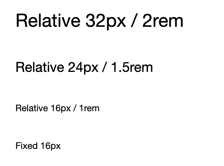
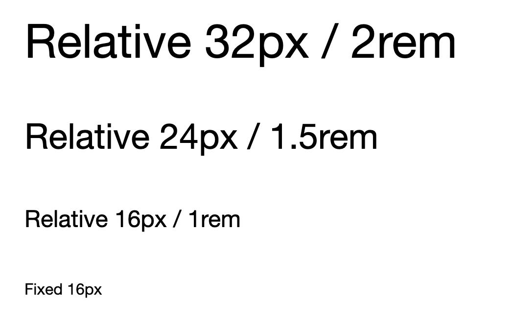
<h1>Relative 32px / 2rem</h1>

<h2>Relative 24px / 1.5rem</h2>

<h3>Relative 16px / 1rem</h3>

<p>Fixed 16px</p>
In this screenshot, you can see the regular px and rem are the same for size 16.
However, if we increase our browser font size, we can see px value fails to scale in the browser properly.
By using rem, we allow our UI to scale appropriately and improve the accessibility of our sites. This trick of using CSS Custom Properties is handy for Web Components. Using Web Components and Rem works like regular HTML and CSS; however, if your component ships with a different base font than the consuming application, your rem values could be off. But by storing our --base variable, we can easily adjust the base value for our Web Components by sharing the same --base variable.
Check out the full working demo below!


%20--%3e)
%20--%3e)
'%20points='107.644,470.877%2074.633,100.62%20437.367,100.62%20404.321,470.819%20255.778,512'/%3e%3cpolygon%20fill='hsl(18,%2086%25,%2055%25)'%20points='256,480.523%20376.03,447.246%20404.27,130.894%20256,130.894'/%3e%3cg%3e%3cpolygon%20fill='%23EBEBEB'%20points='256,268.217%20195.91,268.217%20191.76,221.716%20256,221.716%20256,176.305%20255.843,176.305%20142.132,176.305%20143.219,188.488%20154.38,313.627%20256,313.627'/%3e%3cpolygon%20fill='%23EBEBEB'%20points='256,386.153%20255.801,386.206%20205.227,372.55%20201.994,336.333%20177.419,336.333%20156.409,336.333%20162.771,407.634%20255.791,433.457%20256,433.399'/%3e%3c/g%3e%3cg%3e%3cpath%20d='M108.382,0h23.077v22.8h21.11V0h23.078v69.044H152.57v-23.12h-21.11v23.12h-23.077V0z'/%3e%3cpath%20d='M205.994,22.896h-20.316V0h63.72v22.896h-20.325v46.148h-23.078V22.896z'/%3e%3cpath%20d='M259.511,0h24.063l14.802,24.26L313.163,0h24.072v69.044h-22.982V34.822l-15.877,24.549h-0.397l-15.888-24.549v34.222%20h-22.58V0z'/%3e%3cpath%20d='M348.72,0h23.084v46.222h32.453v22.822H348.72V0z'/%3e%3c/g%3e%3cg%3e%3cpolygon%20fill='%23FFFFFF'%20points='255.843,268.217%20255.843,313.627%20311.761,313.627%20306.49,372.521%20255.843,386.191%20255.843,433.435%20348.937,407.634%20349.62,399.962%20360.291,280.411%20361.399,268.217%20349.162,268.217'/%3e%3cpolygon%20fill='%23FFFFFF'%20points='255.843,176.305%20255.843,204.509%20255.843,221.605%20255.843,221.716%20365.385,221.716%20365.385,221.716%20365.531,221.716%20366.442,211.509%20368.511,188.488%20369.597,176.305'/%3e%3c/g%3e%3c/g%3e%3c/g%3e%3c/switch%3e%3c/svg%3e)