
'%3e%3cpath%20d='m222.077%2039.192-8.019%20125.923-76.671-165.115zm-53.105%20162.825-57.933%2033.056-57.934-33.056%2011.783-28.556h92.301zm-57.933-139.342%2030.357%2073.803h-60.715zm-103.102%20102.44-7.937-125.923%2084.69-39.192z'%20fill='url(%23a)'/%3e%3cpath%20d='m222.077%2039.192-8.019%20125.923-76.671-165.115zm-53.105%20162.825-57.933%2033.056-57.934-33.056%2011.783-28.556h92.301zm-57.933-139.342%2030.357%2073.803h-60.715zm-103.102%20102.44-7.937-125.923%2084.69-39.192z'%20fill='url(%23b)'/%3e%3c/g%3e%3c/svg%3e)
Angular Accessibility Tips and Tricks
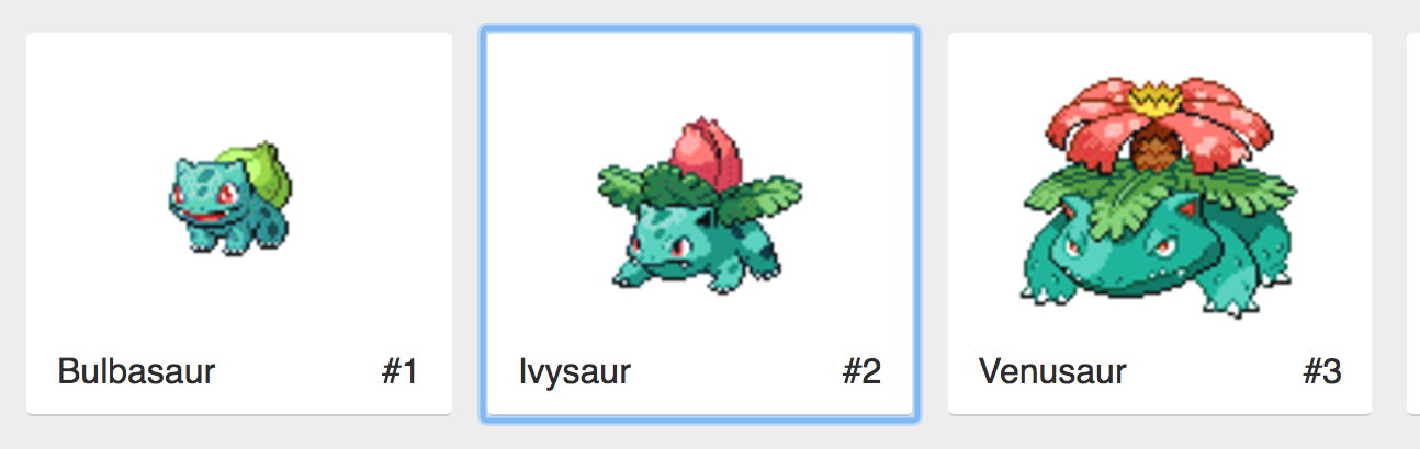
Accessibility (a11y) is often an overlooked aspect of building web applications, especially JavaScript Single Page Apps. Things like forms, routing, and event handling are often easy to get wrong in a JavaScript framework. In this post, we will cover some general best practices for accessibility for your web app as well as more specific topics for Angular apps. This post will be updated over time as Angular a11y features improve or change. For this article we will use the Angular Pokedex an app as an example use case.
Buttons
The most common offender to a11y in Angular apps that I have seen is how click events are used. With Angular's template binding syntax, it's straightforward to create click events on practically anything we want.
<!-- Incorrect -->
<div (click)="save()" class="btn">
  Save
</div>

<!-- Correct -->
<button (click)="save()" class="btn">
  Save
</button>
To keep our application accessible we want to always use the button element for (click) events. This helps in a few different ways. First buttons are easily focusable. Using just the keyboard, we can tab to a button element, assisting users with any motor disabilities. Using a button as well by default provides a focus style that outlines the button currently focused. This functionality allows it easy to navigate and tab the active button.
Links / Anchor Tags
Links (anchor tags) in Angular follow similar rules to buttons when it comes to a11y. With links, we want to ensure we don't remove focus styles. This allows navigation easy to use with keyboards.
Links should not be used for button click events. If you need a button to look like a link, then style it with CSS. Links should primarily be used for linking between navigation views.
<!-- Incorrect -->
<div (click)="navigateToAbout()" class="btn">
  About
</div>

<!-- Correct -->
<a routerLink="about" class="btn">
  About
</a>
Using links for navigation provides a few benefits. Links allows context to SEO search engines and a11y tools. With links, this makes it clear that the interaction will cause navigation to elsewhere in our app. Using links for navigation allows our app to be easily shared and bookmarkable.
Forms
In Angular, the form system is quite robust and feature-rich, but there are some best a11y practices to keep in mind when constructing our forms. Most Angular forms follow the same rules for any accessible HTML form.
First recommendation is use HTML form tag. Using a form tag makes it clear to the user that this is an input form to gather data. This also makes it easier for keyboard tabbing and navigation. When an HTML form is created, it allows saving the form to be triggered by not just a submit button but also using the enter key by default. Using Angular's Reactive Forms this is fairly easy to do.
<form [formGroup]="searchForm" (ngSubmit)="search()">
  <label for="search">Search</label>
  <input
    type="text"
    id="search"
    placeholder="Search"
    formControlName="search"
  />
  <button>Search</button>
</form>
When creating inputs always have an associated label to describe what the input is for. You can do this with the label element tag. If you don't want a separate label, you can use the aria-label in combination with placeholder. Inputs also have focus styles just like buttons and link. Make sure to leave the defaults on or if its a custom input make sure to add focus styles back to the input.
ARIA Attributes
With some instances in Angular we may want to make a custom component but also want to ensure it is accessible as well. We can add particular ARIA (Assistive Rich Internet Applications) attributes to mark our templates in a way that explicitly describes what our component is doing making it more accessible.
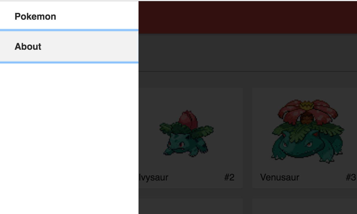
In the Angular Pokedex app we have a custom menu nav component that opens and closes as a slide out overlay. In our app, we want to use ARIA attributes to describe when the menu is visible explicitly. ARIA attributes help screen readers understand when dynamic content has entered into view. There are many ARIA attributes with different forms of functionality but for our example we will be using aria-hidden.
<nav class="nav" (click)="navOpen = !navOpen" [attr.aria-hidden]="!navOpen">
  <a routerLink="/pokemon" class="nav__link" [attr.tabindex]="navOpen ? 0 : -1">
    Pokemon
  </a>
  <a routerLink="/about" class="nav__link" [attr.tabindex]="navOpen ? 0 : -1">
    About
  </a>
</nav>
With Angular's property binding syntax, we can easily bind to the attributes of our navigation allowing us to set the aria-hidden property with [attr.aria-hidden]="!navOpen". Now when we toggle our nav, the Aria attribute is explicitly set to describe when the navigation is visible or not on the view. Find out more about ARIA here.
Summary
There are still many more topics on accessibility such as color contrast and a11y test tools. This just scratched the surface of where Angular and Accessibility meet. To find more resources on a11y check out the fantastic A11Y Project.


%20--%3e)
%20--%3e)
