
'%3e%3cpath%20d='m222.077%2039.192-8.019%20125.923-76.671-165.115zm-53.105%20162.825-57.933%2033.056-57.934-33.056%2011.783-28.556h92.301zm-57.933-139.342%2030.357%2073.803h-60.715zm-103.102%20102.44-7.937-125.923%2084.69-39.192z'%20fill='url(%23a)'/%3e%3cpath%20d='m222.077%2039.192-8.019%20125.923-76.671-165.115zm-53.105%20162.825-57.933%2033.056-57.934-33.056%2011.783-28.556h92.301zm-57.933-139.342%2030.357%2073.803h-60.715zm-103.102%20102.44-7.937-125.923%2084.69-39.192z'%20fill='url(%23b)'/%3e%3c/g%3e%3c/svg%3e)
Build Accessible Forms with Angular
This post is an excerpt chapter from my new EBook Angular Form Essentials
Using Angular and accessibility (a11y) best practices we can create complex forms that any user can use. When building accessible HTML forms, we have several things we must consider. Some users have mobility issues and can only use the Web via keyboard or other non-mouse inputs. Other users may have vision disabilities that require the use of a screen reader or have difficulties with color blindness. With well-structured HTML and Angular, we can make our forms accessible for all users.
In this post, we will break down several critical components of making an Angular form accessible.
- HTML Form Basics
- Angular Reactive Forms
- Multiple Angular Form Groups
- Accessible Form Validation
- Accessible Inline Form Validation
- Angular Form Group Validation
- Accessible Form Validation Summary
- Accessible Form Status Messages
Many of these concepts will apply to making accessible forms in other tools like React Vue.
HTML Form Basics
In our example, we will slowly build up to a sophisticated multi-step user sign up form by using accessibility best practices from the start. Our form has three groups of information for the user to fill out, a name, contact information and, account information.
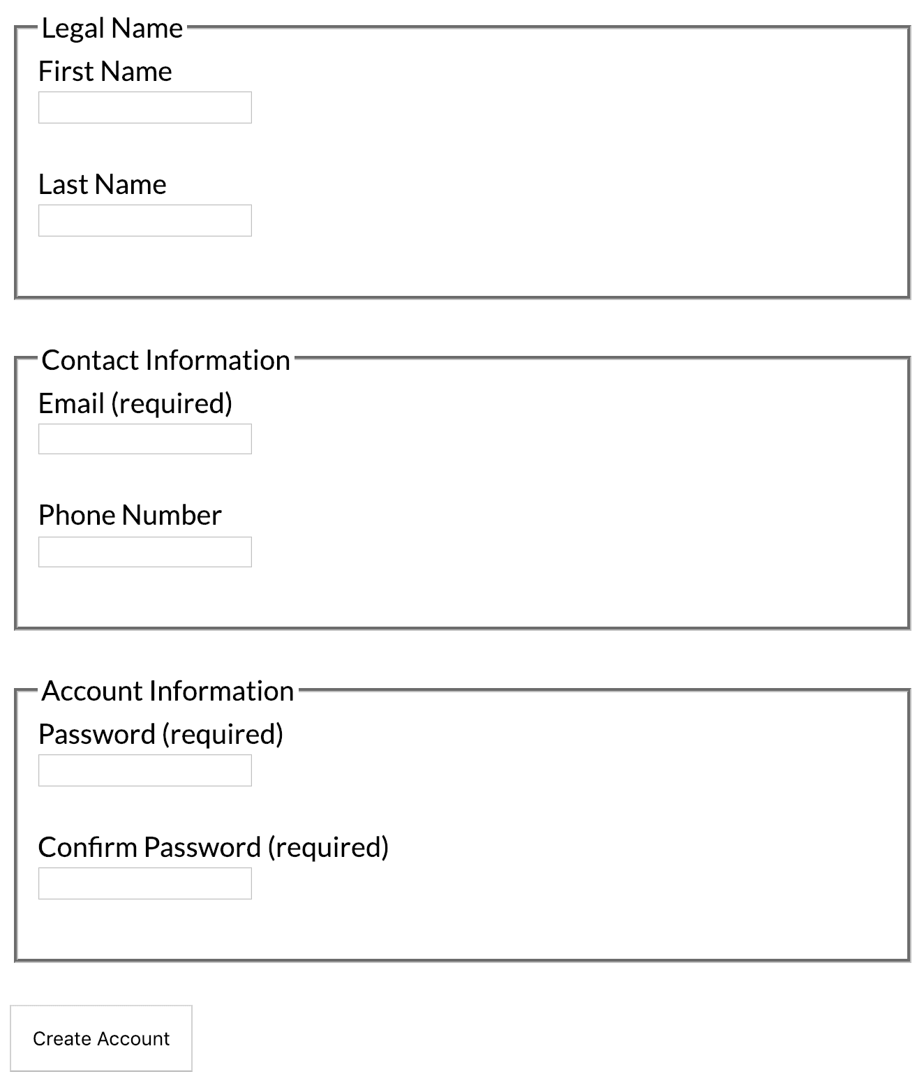
First, we will start with creating a basic HTML form with first name and last name with no Angular interactivity just yet.
<form>
  <label for="first">First Name</label>
  <input id="first" />

  <label for="last">Last Name</label>
  <input id="last" />

  <button>Create Account</button>
</form>
The first step for accessible forms is to provide a label for each input in the form. Defining a label allows screen readers to read aloud the description of what the purpose of the input is. Two popular and easily available screen readers to test with are Voiceover (Mac OS) and Chrome Vox (Chrome OS / Chrome).
We associate a label with the for attribute and match it to an id attribute of an existing input. Another benefit of assigning a label to an input is when the user clicks on a label the browser focuses the associated input.
Another critical aspect of building not only accessible forms but better user experiences is to have a clear call to action with your form submit button. Instead of generic messages such as "save" or "submit" be specific to what the action is accomplishing for example, "Create Account" or "Update Your Profile".
Angular Reactive Forms
Now that we have the basics of our form defined we can start wiring up our form to Angular to make it interactive. In this example, we will use the Angular Reactive Forms package as it allows us to keep our templates simple and validation logic in the TypeScript code of our components.
First, we need to import the ReactiveFormsModule into our application module.
import { NgModule } from '@angular/core';
import { BrowserModule } from '@angular/platform-browser';
import { ReactiveFormsModule } from '@angular/forms';

import { AppComponent } from './app.component';

@NgModule({
  imports: [BrowserModule, ReactiveFormsModule],
  declarations: [AppComponent],
  bootstrap: [AppComponent]
})
export class AppModule {}
Once imported we can now start using the Reactive Forms API to build our sign up form.
import { Component } from '@angular/core';
import { FormGroup, FormControl } from '@angular/forms';

@Component({
  selector: 'my-app',
  templateUrl: './app.component.html',
  styleUrls: ['./app.component.css']
})
export class AppComponent {
  form = new FormGroup({
    name: new FormGroup({
      first: new FormControl(''),
      last: new FormControl('')
    })
  });

  submit() {
    console.log(this.form.value);
  }
}
When creating our form, we use a combination of the FormGroup class and the FormControl class. FormGroup allows us to create a group or collection of related FormControl inputs. A FormControl represents a single form input in our HTML template. If we look, we see that our example uses two FormGroup instances.
form = new FormGroup({
  name: new FormGroup({
    first: new FormControl(''),
    last: new FormControl('')
  })
});
The first group is the form element itself and contains all inputs of the form. Our second form group is grouping the two name inputs, first and last. We group these inputs to make it easier to manage and validate as we add additional steps and groups such as contact information and password validation. We will see how to add additional groups in our example soon.
When we create a group each property of the group corresponds to a single input so our example first and last name. Each property is an instance of FormControl. The FormControl class takes two parameters. The first parameter is the initial value we want for our input, the second parameter is one to many validator rules to apply to our input.
Next we need to assign our new Angular form to the form in our HTML template:
<form [formGroup]="form" (ngSubmit)="submit()">
  <fieldset formGroupName="name">
    <legend>Legal Name</legend>
    <label for="first">First Name</label>
    <input formControlName="first" id="first" />

    <label for="last">Last Name</label>
    <input formControlName="last" id="last" />
  </fieldset>

  <button>Create Account</button>
</form>
The first [formGroup] binding on the HTML form tag assigns the form property of our component linking the Angular form to the HTML form. The (ngSubmit) event allows us to listen for when the user submits the form by clicking our form button or using the enter key.
In our form, we have added the fieldset and legend HTML tags. The fieldset and legend tags allow us to describe a collection of related inputs and a descriptive label. Fieldset is commonly used with collections of inputs such as radios and checkboxes. While not required, fieldset and legend are also important for large forms to make it clear what the inputs are doing and how they are interrelated. By adding a fieldset and legend we also further assist anyone using a screen reader to understand better what the form is trying to accomplish when visual cues such as white space are not available. On each fieldset we can attach our inner form group so Angular's form groups can associate to a given fieldset.
Lastly, we need to associate each input to the given FormControl in our TypeScript. Using formControlName, we can assign the control name to the given input which assigns any default value as well as applies the appropriate validation if any.
Multiple Angular Form Groups
Now our form is functional we can start to add additional form groups to our form. By having multiple groups, we can make it easier to validate our forms as well as improve the accessibility of our form. Our sign up form currently has just a first and last name, let's go ahead and add a new group called the contact group. The contact group contains the inputs for the user's email and phone number. Let's start with taking a look at the TypeScript.
import { Component } from '@angular/core';
import {
  FormGroup,
  FormControl,
  Validators,
  ValidationErrors
} from '@angular/forms';

@Component({
  selector: 'my-app',
  templateUrl: './app.component.html',
  styleUrls: ['./app.component.css']
})
export class AppComponent {
  form = new FormGroup({
    name: new FormGroup({
      first: new FormControl(''),
      last: new FormControl('')
    }),
    contact: new FormGroup({
      email: new FormControl('', [Validators.required, Validators.email]),
      phone: new FormControl('')
    })
  });

  submit() {
    console.log(this.form.value);
  }
}
We added a new property contact which contains a new FormGroup instance. This group contains the email and phone number FormControls for our next step in our sign up form. You can optionally use the FormBuilder service to build your form but to emphasize better how the form is instantiated we will manually instantiate each input. Next, we need to create the HTML and wire up our new FormGroup.
<form [formGroup]="form" (ngSubmit)="submit()">
  <fieldset formGroupName="name">
    <legend>Legal Name</legend>
    <label for="first">First Name</label>
    <input formControlName="first" id="first" />

    <label for="last">Last Name</label>
    <input formControlName="last" id="last" />
  </fieldset>

  <fieldset formGroupName="contact">
    <legend>Contact Information</legend>
    <label for="email">Email (required)</label>
    <input formControlName="email" id="email" type="email" />

    <label for="phone">Phone Number</label>
    <input formControlName="phone" id="phone" />
  </fieldset>
  <button>Create Account</button>
</form>
Now that we have our second group added we need to handle some validation logic in our template for the new required email input.
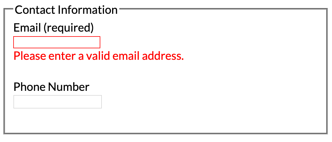
Accessible Form Validation
In our example form, we now have an email input that is required and must match an email address format. We have to convey this information clearly to our users as well as properly handle screen readers. Let's take a look at our updated template for the email input.
<legend>Contact Information</legend>
<label for="email">Email (required)</label>
<input formControlName="email" id="email" type="email" required />
Because the email input is required, there are a couple of additional things we need to do for user experience and accessibility. First, in our label for the email input, we add the word required. By adding required in the label makes it easier for users upfront to know they should add an email address versus getting to the end of the form and having to backtrack to previous inputs. By explicitly using the word "required" this also helps screen reader users in the same way.
Do not use patterns such as marking required fields with an "*" asterisk, when read by a screen reader does not convey to the user that the input is required. We can also add the required attribute to our input as this helps screen readers additionally understand the input that is required for the user to enter. I would love to see Angular be able to dynamically add the required attribute whenever the Validators.required is used on an Angular form to improve accessibility out of the box.
Note it is also essential to take advantage of HTML5 input types when appropriate. In our use case, we use type="email" on the email input. By using the proper input type, we can take advantage of native input behavior such as a better on-screen keyboard optimized for email inputs.
Accessible Inline Form Validation
Next, we need to add our validation message and set validation state for accessibility on our email input. Inline validation allows us to notify the user quickly that something needs to be corrected to prevent them from submitting the form and having backtrack to previous inputs.
Let's take a look at our updated template and TypeScript for determining if the input is invalid.
<label for="email">Email (required)</label>
<input
  [attr.aria-invalid]="emailIsInvalidAndTouched"
  formControlName="email"
  id="email"
  type="email"
  required
/>
If the input is invalid and the user has focused the input, then we show the appropriate message to the user below our email input. On our input, we set the [aria-invalid attribute](https://developer.mozilla.org/en-US/docs/Web Accessibility/ARIA/ARIA_Techniques/Using_the_aria-invalid_attribute) to true whenever the input is invalid as this helps notify screen readers that the input is invalid and needs the user's attention.
Unfortunately here due to the nesting behavior of the FormGroup the syntax to check the input validity is rather verbose, so we abstract it into a getter properties in our component so we don't duplicate the logic in our template.
// Be careful when using get() properties as they are called multiple time per change detection cycle
// Example putting an async HTTP call in the get() would cause several HTTP requests in the matter of seconds hurting performance
get emailIsInvalid() {
  return (this.form.controls.contact as FormGroup).controls.email.invalid;
}

get emailIsInvalidAndTouched() {
  return  this.emailIsInvalid && (this.form.controls.contact as FormGroup).controls.email.touched;
}

get passwordIsInvalid() {
  return (this.form.controls.password as FormGroup).controls.password.invalid;
}

get passwordIsInvalidAndTouched() {
  return this.passwordIsInvalid && (this.form.controls.password as FormGroup).controls.password.touched;
}

get passwordsDoNotMatch() {
  return this.form.controls.password.errors && this.form.controls.password.errors.mismatch;
}

get passwordsDoNotMatchAndTouched() {
  return this.passwordsDoNotMatch && (this.form.controls.password as FormGroup).controls.confirm.touched;
}
Now that we have the logic in place to determine if the email input is invalid and touched we can add our message to show the user when our email input is invalid. We will use the non touched checks later in our example.
<label for="email" id="email-label">Email (required)</label>
<input
  [attr.aria-invalid]="emailIsInvalidAndTouched"
  formControlName="email"
  id="email"
  type="email"
  required
/>

<div
  *ngIf="emailIsInvalidAndTouched"
  role="alert"
  aria-describedby="email-label"
  tabindex="0"
  class="error"
>
  Please enter a valid email address.
</div>
First, we need to add a new id attribute id="email-label" to our label. This id is used to associate our error message to the label. Next, we have our Error message which contains several attributes. First, we have our *ngIf which toggles the element in the DOM whenever the email is invalid. Next, we have the role="alert" attribute which triggers the screen reader to immediately read the content in the element to notify the user that an error has occurred.
The next attribute aria-describedby="email-label" allows the screen reader to notify that the given validation/alert message belongs or is associated with the email label. This association makes it easier to understand that the error is for the email input. Lastly, we have the inline validation message set to have a tabindex="0". Setting the tab index makes the validation message focusable making it easier to discover as the user tabs through our form to fix any validation issues.
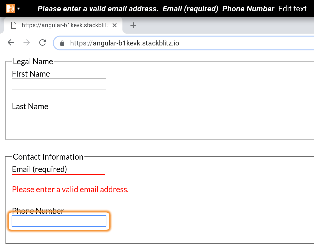
Using Chrome Vox we can see that the screen reader successfully reads the inline validation error message and the associated label. Do not try to refocus the input with the validation error as it can be confusing to have navigation jumping without users direct input. Allow the user to tab back and refocus the input as necessary.
Angular Form Group Validation
The next step in our sign up form builds on more of what we have covered by adding a password and confirm password input.
<fieldset formGroupName="password">
  <legend>Account Information</legend>
  <label for="password" id="password-label">Password (required)</label>
  <input
    [attr.aria-invalid]="passwordIsInvalidAndTouched"
    formControlName="password"
    id="password"
    type="password"
    required
  />
  <div
    *ngIf="passwordIsInvalidAndTouched"
    role="alert"
    aria-describedby="password-label"
    tabindex="0"
    class="error"
  >
    Password must be at least 6 characters.
  </div>

  <label for="confirm" id="confirm-label">Confirm Password (required)</label>
  <input formControlName="confirm" id="confirm" type="password" required />

  <div
    *ngIf="passwordsDoNotMatchAndTouched"
    role="alert"
    aria-describedby="confirm-label"
    tabindex="0"
    class="error"
  >
    Passwords must match.
  </div>
</fieldset>
The last step in the form is slightly more complex as it must compare two inputs, password and confirm password for validation. In the TypeScript, we can create a FormGroup validator that allows us to validate multiple FormControls instead of a single FormControl.
...
form = new FormGroup({
  name: new FormGroup({
    first: new FormControl(''),
    last: new FormControl('')
  }),
  contact: new FormGroup({
    email: new FormControl('', [Validators.required, Validators.email]),
    phone: new FormControl('')
  }),
  password: new FormGroup({
    password: new FormControl('', [Validators.required, Validators.minLength(6)]),
    confirm: new FormControl('', Validators.required)
  }, matchingInputsValidator('password', 'confirm', 'missmatch'))
});

get passwordsDoNotMatch() {
  return this.form.controls.password.errors && this.form.controls.password.errors.missmatch && (this.form.controls.password as FormGroup).controls.confirm.touched;
}

// Angular validators expect a function to be passed as the parameter so it can execute,
// here we create a function dynamically to return to the form for Angular
export function matchingInputsValidator(firstKey: string, secondKey: string, errorName: string) {
  return function (group: FormGroup): ValidationErrors | undefined {
    if (group.controls[firstKey].value !== group.controls[secondKey].value) {
      return {
        [errorName]: true
      };
    }
  };
}
...
Now that we have all three groups of our form created, it's essential to test that the tab flow makes sense to the user. Starting at the top of your page test to see if tabbing through the page results in a linear expected experience. Users that have mobility disabilities may only be able to navigate the page via keyboard commands so tab order is essential to test with your forms.
Accessible Form Validation Summary
Now that we have our form functional and the inline validation working we need to handle displaying a validation summary. A validation summary displays a list of errors whenever a user has submitted the form and may have skipped input fields that need to be corrected.
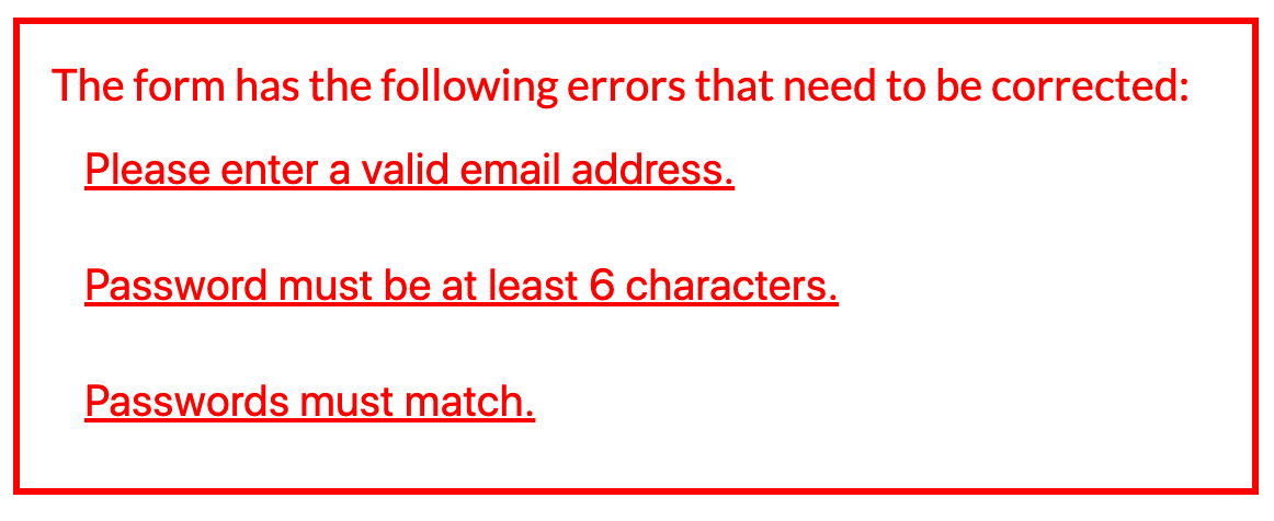
To display our validation summary, we need to track when the user has submitted the form and check the validation of our inputs. Let's take a look at our updated submit method.
<div
  *ngIf="this.form.invalid && formSubmitted"
  role="alert"
  class="status-error"
>
  The form has the following errors that need to be corrected:

  <div *ngIf="emailIsInvalid">
    Please enter a valid email address.
  </div>

  <div *ngIf="passwordIsInvalid">
    Password must be at least 6 characters.
  </div>

  <div (click)="confirmRef.focus()" *ngIf="passwordsDoNotMatch">
    Passwords must match.
  </div>
</div>
In our template, we show the summary only if the form has been submitted and there is at least one form validation error. This works well, but we can further improve the user experience and accessibility of the validation summary.
With each error message, we can create a click event to focus the input that needs attention. You could achieve this with in-page anchors with regular HTML, but with Angular and client-side routing we have to do something slightly more complicated.
We update each error message to a button with a click event. On each input that we want to navigate to; we add a special Angular template syntax called a template reference variable.
...
<!-- The '#' creates a template reference variable we can use later in our template -->
<input
  #emailRef
  [attr.aria-invalid]="emailIsInvalidAndTouched"
  formControlName="email"
  id="email"
  type="email"
  required
/>

...

<button (click)="emailRef.focus()" *ngIf="emailIsInvalid">
  Please enter a valid email address.
</button>
...
For each input, we want to focus explicitly, we will need to create a unique template reference variable for each corresponding input.
...
<div
  *ngIf="this.form.invalid && formSubmitted"
  role="alert"
  class="status-error"
>
  The form has the following errors that need to be corrected:

  <button (click)="emailRef.focus()" *ngIf="emailIsInvalid">
    Please enter a valid email address.
  </button>

  <button (click)="passwordRef.focus()" *ngIf="passwordIsInvalid">
    Password must be at least 6 characters.
  </button>

  <button (click)="confirmRef.focus()" *ngIf="passwordsDoNotMatch">
    Passwords must match.
  </button>
</div>
...
Now for any user when the validation summary shows the user can quickly navigate to the input that needs to be fixed easily.
Accessible Form Status Messages
The last step for our accessible form is to provide status updates to the user when the form is processing data. We covered error statuses; next, we create a pending status and success status for when data is saved asynchronously.
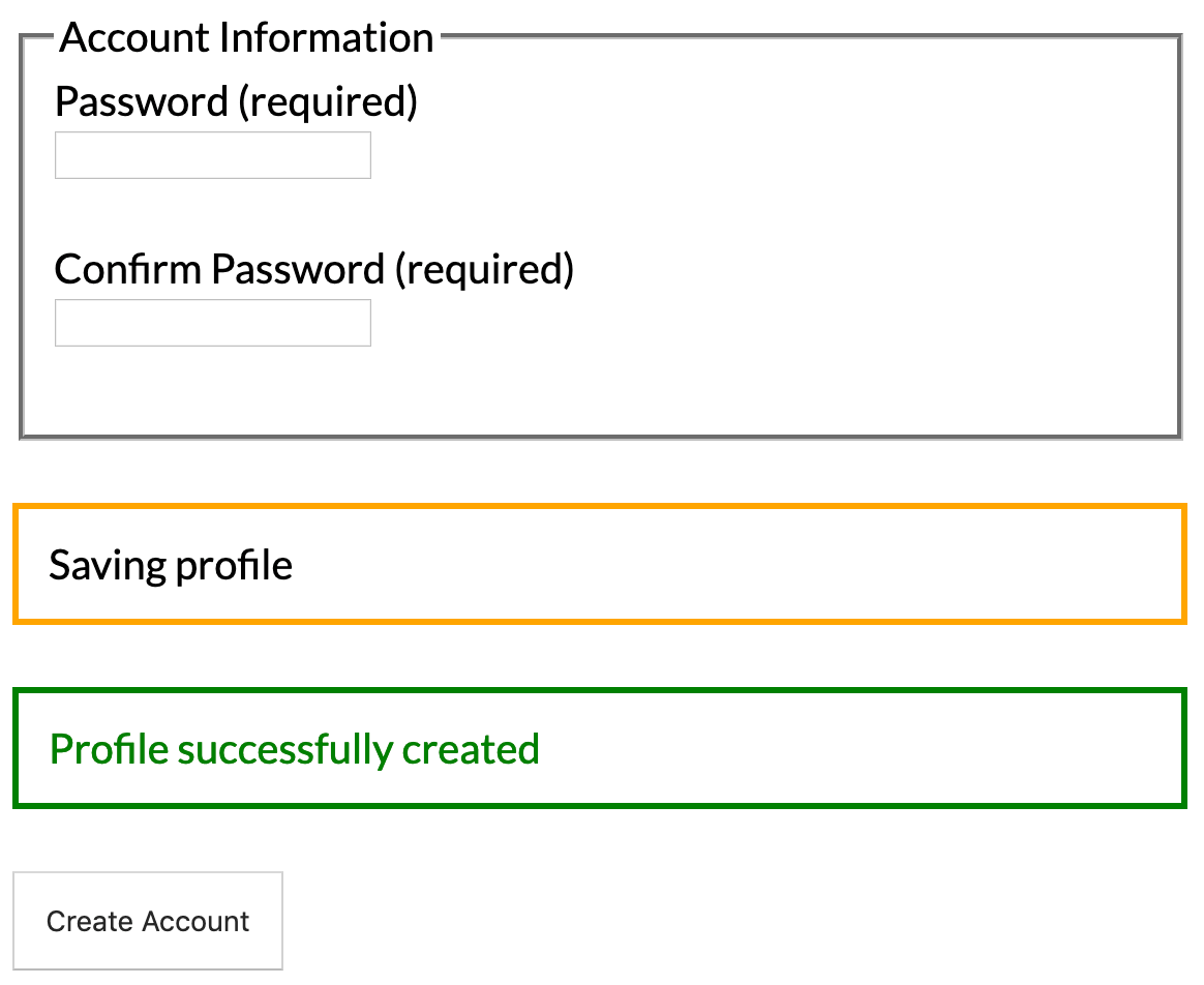
Here is an image showing both the pending and success status messages of our form. Notice the pending message the text is black instead of the matching orange border. We don't match the colors to make sure the text has enough color contrast, so it's clear and easily visible for all users. You can test your colors to see if they are accessible by using contrast-ratio.com.
To start creating our status messages, we are going to do a little bit of refactoring and create a TypeScript enum to represent the state of our form.
export enum FormStatus {
  Initial,
  Success,
  Pending,
  Error
}

...

export class AppComponent  {
  // bind the enum to the component so we can reference it in our template
  FormStatus = FormStatus;
  // initialize the status
  formStatus = FormStatus.Initial;
  ...
}
Now we can update our submit method to emulate our async event similar to saving the form data to an API endpoint.
...
submit() {
  this.formStatus = FormStatus.Pending;

  if (this.form.valid) {
    setTimeout(() => { // simulate a slow async http/api call
      this.formStatus = FormStatus.Success;
      console.log(this.form.value);
    }, 3000);
  } else {
    this.formStatus = FormStatus.Error;
  }
}
...
Now when our form is submitted, we can set the form to the pending state and show a pending message to the user. When our API call completes, we can then display a success message.
...
<div
  *ngIf="formStatus === FormStatus.Pending"
  role="status"
  class="status-pending"
>
  Saving profile
</div>

<div
  *ngIf="formStatus === FormStatus.Success"
  role="status"
  class="status-success"
>
  Profile successfully created
</div>
...
When displaying our status messages, we use the role="status" attribute. The main difference between role="status" and role="alert" is that role="status" will wait if the screen reader is paused before reading the status aloud. The role="alert" immediately causes the screen reader to read the alert even if the reader is in the middle of reading other content on the page. By using role="status" we can be more considerate of the user and not interrupt or stop what they are doing.
Summary
Getting accessibility right can be challenging but using Angular we can create dynamic client-side JavaScript forms while keeping them accessible to all users. I hope to see more built-in accessibility support from frameworks and community UI component libraries in the future. Check out the full working example in the link below!


%20--%3e)
%20--%3e)
