

Better UX CSS Hover Navigation
The CSS hover based drop down nav has been a common option when organizing our website's navigation. Simple and easy to build with decent user experience the drop down can seem like reasonable choice. With a small bit of JavaScript we can also get good touch support. Often though when using hover effects to open drop downs users run into something like this:
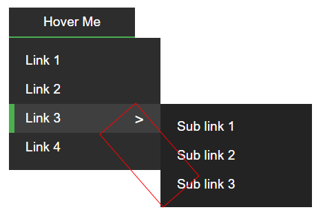
The user saw the bottom link in the sub nav and tried to click it. Because our nav displays on hover, when the cursor leaves the element the hover is no longer applied. This in turn the causes our nav to no longer display. Using Pseudo-elements and CSS transforms we can create additional elements to allow the hover area to be larger. Doing this creates a buffer area that will allow the user's mouse to veer off of the menu. So we will have something like this:
Below is a snippet example from our demo of how this would look.
// Don't worry to much about the details but just look and see how we are using
// the :after selector to create a new Pseudo-element.

// Sub nav that is displayed when a nav button is hovered
.nav__sub-nav__btn.has-sub-nav:after {
  content: '';
  display: none;
  width: 68px;
  height: 139px;
  position: absolute;
  right: -19px;
  top: 4px;
  transform: rotate(-41deg);
  z-index: 99;
}

// On hover of our nav we show our Pseudo-element that we created above.
.has-sub-nav:hover:after {
  display: block;
}

// On hover of our extra Pseudo-element we show the sub nav
.has-sub-nav:after:hover > .nav__sub-nav {
  display: block;
  top: 0;
  left: 238px;
  z-index: 100;
}
The extra element allows our hover state to continue while the user moves their mouse outside of the parent menu button. Using z-index we place our new element between the nav and the sub nav to get the final result:
This is not a perfect solution. There is still a chance of the users mouse venturing out too far but this does provide a better user experience with only a little more code. Check out a full working demo on Codepen below with included JavaScript for touch support.


%20--%3e)
%20--%3e)
'%20points='107.644,470.877%2074.633,100.62%20437.367,100.62%20404.321,470.819%20255.778,512'/%3e%3cpolygon%20fill='hsl(18,%2086%25,%2055%25)'%20points='256,480.523%20376.03,447.246%20404.27,130.894%20256,130.894'/%3e%3cg%3e%3cpolygon%20fill='%23EBEBEB'%20points='256,268.217%20195.91,268.217%20191.76,221.716%20256,221.716%20256,176.305%20255.843,176.305%20142.132,176.305%20143.219,188.488%20154.38,313.627%20256,313.627'/%3e%3cpolygon%20fill='%23EBEBEB'%20points='256,386.153%20255.801,386.206%20205.227,372.55%20201.994,336.333%20177.419,336.333%20156.409,336.333%20162.771,407.634%20255.791,433.457%20256,433.399'/%3e%3c/g%3e%3cg%3e%3cpath%20d='M108.382,0h23.077v22.8h21.11V0h23.078v69.044H152.57v-23.12h-21.11v23.12h-23.077V0z'/%3e%3cpath%20d='M205.994,22.896h-20.316V0h63.72v22.896h-20.325v46.148h-23.078V22.896z'/%3e%3cpath%20d='M259.511,0h24.063l14.802,24.26L313.163,0h24.072v69.044h-22.982V34.822l-15.877,24.549h-0.397l-15.888-24.549v34.222%20h-22.58V0z'/%3e%3cpath%20d='M348.72,0h23.084v46.222h32.453v22.822H348.72V0z'/%3e%3c/g%3e%3cg%3e%3cpolygon%20fill='%23FFFFFF'%20points='255.843,268.217%20255.843,313.627%20311.761,313.627%20306.49,372.521%20255.843,386.191%20255.843,433.435%20348.937,407.634%20349.62,399.962%20360.291,280.411%20361.399,268.217%20349.162,268.217'/%3e%3cpolygon%20fill='%23FFFFFF'%20points='255.843,176.305%20255.843,204.509%20255.843,221.605%20255.843,221.716%20365.385,221.716%20365.385,221.716%20365.531,221.716%20366.442,211.509%20368.511,188.488%20369.597,176.305'/%3e%3c/g%3e%3c/g%3e%3c/g%3e%3c/switch%3e%3c/svg%3e)