Using Web Components in React
Cory Rylan
- 5 minutes
This post we will learn how to use Web Components in ReactJS. React is a JavaScript library made by Facebook that allows developers to compose UIs with components. React was one of the first JavaScript library/frameworks to popularize component driven architecture. React was also created before the Web Components APIs were standardized. Because of this, React does not have broad support for Web Components/Custom Elements like the majority of other JavaScript libraries and frameworks.
Web Components in Angular and VueJS
When using Web Components in other frameworks like Angular or Vue, we get built-in native support. In this post, we will use a vanilla dropdown Web Component. We won't go into the implementation of the dropdown component, but if you want more info on how to build your own Web Components, check out the following posts:
Introduction to Web Components
Building Web Components with Lit
Web Components can be used anywhere and work just like regular HTML elements when using plain JavaScript.
<!DOCTYPE html>
<html>
  <head> </head>
  <body>
    <x-dropdown>
      Hello World
    </x-dropdown>

    <script type="module">
      import '/dropdown.js';

      const dropdown = document.querySelector('x-dropdown');
      dropdown.title = 'Custom Title';
      dropdown.addEventListener('show', e => console.log(e));
    </script>
  </body>
</html>
Elements in HTML can communicate via properties, attributes, content slots and events. When using Web Components in Angular or Vue, we simply import the component file or package and use it in the template.
<h1>Angular Application using Web Components</h1>

<p>
  {{open ? 'open' : 'closed'}}
</p>

<x-dropdown [title]="myTitle" (show)="toggle($event)">
  Hello from Web Component in Angular!
</x-dropdown>
<h1>VusJS Application using Web Components</h1>

<p>
  {{show ? 'open' : 'closed'}}
</p>

<x-dropdown :title="myTitle" @show="log">
  Hello from Web Component in Vue!
</x-dropdown>
Both Angular and Vue have a native binding syntax that allows you to set properties and listen to events on native Custom Elements/Web Components. Unfortunately React is incompatible with setting properties and listening to custom events in the browser.
React Compatibility
React uses a similar mechanism for component communication by passing properties and functions as events between components. Unfortunately, the React event system is a synthetic system that does not use the built-in browser custom events. This synthetic system means Web Component events cannot communicate with React components. React, and the JSX templating syntax it uses treats all custom element properties as attributes incorrectly forcing React users only to use string values without additional work.
To overcome these shortcomings in our example, we will show how we can create thin React wrapper components around our Web Components. Wrapper components will allow React to be able to become compatible with our Web Components.
Create React App
To demonstrate Web Components in React, we will use the Create React App CLI tool to easily create a React application. To create our app, we run the following commands:
npx create-react-app my-app
cd my-app
npm start
Once created we will have a full running React application. Now we need to install a Web Component. I published a basic dropdown component to NPM that we can use as an example.
npm install web-component-essentials --saveIn our React application, we will need to create a React Dropdown component to wrap our existing x-dropdown component.
import React, { Component } from 'react';
import 'web-component-essentials';

export class Dropdown extends Component {
  render() {
    return <x-dropdown>{this.props.children}</x-dropdown>;
  }
}
To use our x-dropdown, we import the package into the Dropdown.js React component. In the render function, we add {this.props.children} to pass child elements into our content slot.
Properties and Events
We need to map the Web Component properties and events to our React version of the component. We need to use the componentDidMount() life cycle hook.
import React, { Component } from 'react';
import 'web-component-essentials';

export class Dropdown extends Component {
  constructor(props) {
    super(props);
    this.dropdownRef = React.createRef();
  }

  componentDidMount() {
    this.dropdownRef.current.title = this.props.title;

    if (this.props.onShow) {
      this.dropdownRef.current.addEventListener('show', e =>
        this.props.onShow(e)
      );
    }
  }

  render() {
    return (
      <x-dropdown ref={this.dropdownRef}>{this.props.children}</x-dropdown>
    );
  }
}
Using the Refs API, we can grab a DOM reference to our x-dropdown. Using this reference, we can create our event listener. In our event listener, we can call any passed functions to our onShow prop for our react component. This allows our Web Component to be able to communicate with other React components. We also assign the title prop of our React dropdown to our Web Component property.
// current gets the current DOM element attached to the ref
this.dropdownRef.current.title = this.props.title;
Prop Updates
Next, we need to add additional code for whenever one of the props on our React dropdown change. To listen for prop updates we can use the componentDidUpdate()
lifecycle hook.
import React, { Component } from 'react';
import 'web-component-essentials'; // a basic dropdown is included

export class Dropdown extends Component {
  constructor(props) {
    super(props);
    this.dropdownRef = React.createRef();
  }

  componentDidMount() {
    this.dropdownRef.current.title = this.props.title;

    if (this.props.onShow) {
      this.dropdownRef.current.addEventListener('show', e =>
        this.props.onShow(e)
      );
    }
  }

  componentDidUpdate(prevProps) {
    if (this.props.title !== prevProps.title) {
      this.dropdownRef.current.title = this.props.title;
    }

    if (this.props.show !== prevProps.show) {
      this.dropdownRef.current.show = this.props.show;
    }
  }

  render() {
    return (
      <x-dropdown ref={this.dropdownRef}>{this.props.children}</x-dropdown>
    );
  }
}
Using componentDidUpdate() we can check when props are updated and efficiently update the properties on our Web Component. Now that we have mapped React props to our Web Component properties and events we can use the Dropdown React component.
import React, { Component } from 'react';
import './App.css';
import { Dropdown } from './dropdown.js';

class App extends Component {
  constructor(props) {
    super(props);
    this.state = {
      show: false,
      title: 'project-react'
    };

    this.handleShow = this.handleShow.bind(this);
  }

  render() {
    return (
      <div>
        <h1>React Application using Web Components</h1>

        <p>{this.state.show ? 'open' : 'closed'}</p>

        <Dropdown title={this.state.title} onShow={this.handleShow}>
          Hello from dropdown
        </Dropdown>
      </div>
    );
  }

  handleShow(e) {
    this.setState({ show: e.detail });
  }
}

export default App;
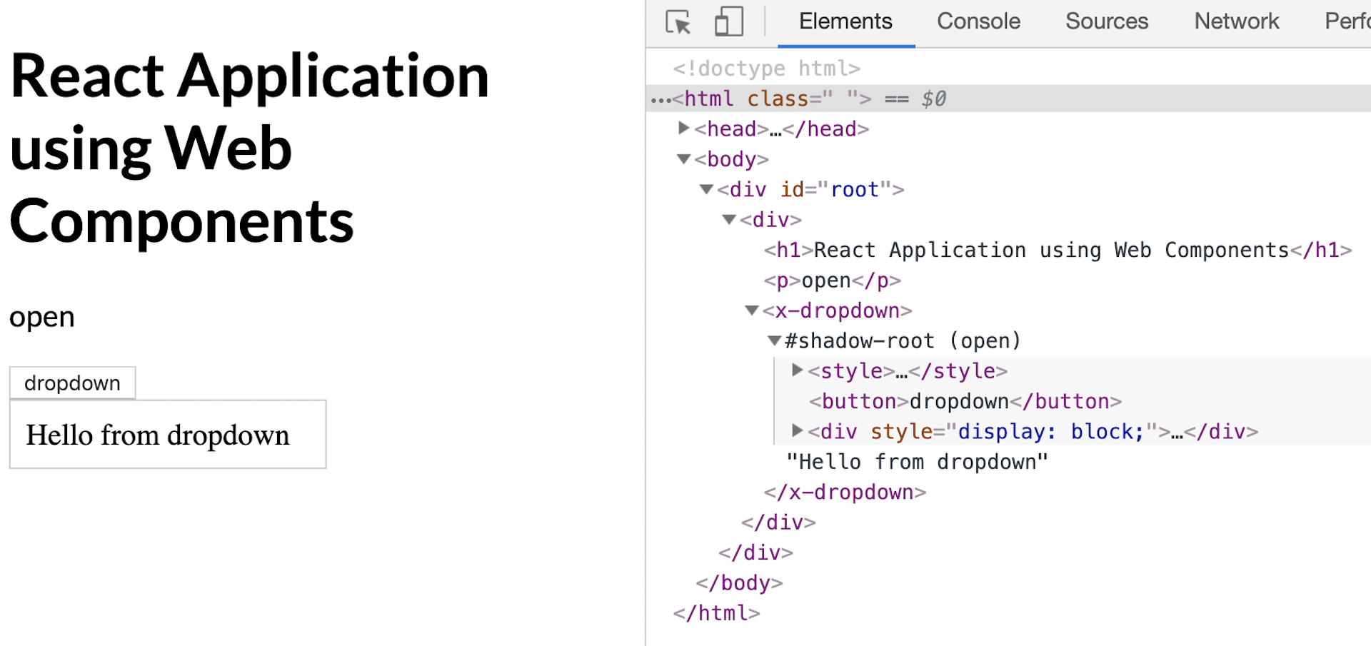
Now we should see our rendered Web Component working in a React application.

In our App component, you can see the syntax is not much different than our Angular and Vue examples. Unfortunately due to the incompatibility of React with the Custom Elements API we have to add a thin compatibility layer between our component.
Hopefully soon React will be able to adapt and become compatible with the Custom Elements API. To follow the status of the open React issues related to Web Components check out custom-elements-everywhere.com.

