

Using Modern Web Components
Cory Rylan
- 5 minutes
Web Components are a collection of native browser APIs that enable developers to build reusable UI components natively in the browser. Web Components work just like regular DOM elements. This compatibility opens the door to reusable UI components. This reusability is excellent for all sorts of use cases such as Design Systems, Micro Frontends, or anywhere the component needs to work regardless of a JavaScript framework.
Building Web Components can be tricky as they are built using a collection of independent low-level APIs. Because these APIs are built into the browser, we can use lightweight libraries to provide syntactic sugar and eliminate some of the boilerplate. One of the major benefits of using Web Components is regardless of how you build the component, it uses the same standard shared public APIs as any other Web Component.
The Public APIs of a Web Component
Web Components work just like HTML elements. We can interact with these elements via HTML Attributes, JavaScript Properties, Custom Events and CSS. For our example, we will use an Alert box to demonstrate each of these public APIs.

Web Components are constructed using two main APIs. Custom Elements and Shadow DOM. The Custom Elements API provides a way to register our own custom HTML tags to the browser. The Shadow DOM API provides a way to encapsulate our component CSS in a way that is not global. These APIs together give us a fully encapsulated and reusable HTML element.
Web Components have five primary public APIs developers will use to communicate and customize the component.
- Content Slots
- HTML Attributes
- CSS Custom Properties/Parts
- JavaScript Properties
- Custom Events
Content Slot API
The Contents Slot API is an API provided by the Shadow DOM. This API allows us to project or render HTML from the light DOM of our HTML into the template or Shadow DOM of the Web Component. Most JavaScript frameworks have similar project features like React children and Angular Content Project.
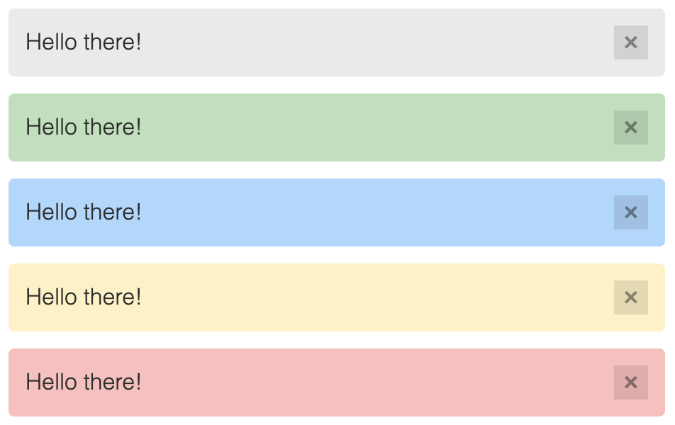
Content Slots work great for container-style components such as Modals, Cards, and Alerts. Given our alert example, we can render content in the alert template.
<ui-alert>
  <p>Hello there!</p>
</ui-alert>
HTML Attributes
We can further customize our Web Components by providing custom HTML Attributes. Attributes can be used as a way to configure or pass information into our Web Component.
<ui-alert status="success">
  <p>Hello there!</p>
</ui-alert>
In this example, we can style our Web Component based on a status success attribute. It's important to note HTML Attributes can only resolve string values. Since the attribute is in HTML, it's all parsed as strings. If you want to pass values other than strings, the Web Component can provide JavaScript properties for other types like Objects and Arrays.
JavaScript Properties
A common misconception is that Web Components can only use strings. However, this is false. Web Components can use any JavaScript type via properties, just like HTML elements and other framework components. For example, we could provide a dissmissable HTML attribute and dissmissable JavaScript boolean property to determine if our alert should show the dismiss button.
If we use plain JavaScript, setting the property would look something like this,
import 'alert.js';

const alert = document.querySelector('ui-alert');
alert.dismissable = true;
Here we use a boolean, but we could also pass any JavaScript type to the property of the component. All JavaScript frameworks support this behavior as this is a standard DOM element API. React is the only tool currently that does not properly support the full DOM spec and requires a shim/wrapper layer. See custom-elements-everywhere.com for details. This issue, however, is fairly easy to work around as Lit provides a package to solve this.
Here are some examples of setting properties in other frameworks,
<!-- Angular -->
<ui-alert [dismissable]="true"></ui-alert>

<!-- Vue -->
<ui-alert :dismissable="true"></ui-alert>

<!-- Preact (uses properties and attr as fallback) -->
<ui-alert dismissable="true"></ui-alert>
As we can see, the current frameworks already enable us to set Properties and Attributes on elements without any extra work.
Custom Events
We can pass data in via HTML Attributes and JavaScript properties. We can also listen for updates from Web Components via Custom Events. For example, our alert can emit an event when the user clicks the dismiss button.
import 'alert.js';

const alert = document.querySelector('ui-alert');
alert.addEventListener('closeChange', event => {
  console.log(event);
});
With Custom Events, we can now react to updates from our elements. Custom Events work just like DOM events, so all frameworks with the exception to React support this out of the box.
<!-- Angular -->
<ui-alert (closeChange)="someMethod()"></ui-alert>

<!-- Vue -->
<ui-alert @closeChange="someMethod"></ui-alert>

<!-- Preact -->
<ui-alert onCloseChange={this.someMethod}></ui-alert>
React does not properly support Custom Events, so the wrapper shim for React is required. See custom-elements-everywhere.com.
CSS Custom Properties and Parts
Lastly, styling Web Components works a bit differently than plain HTML and CSS. Because of the Shadow DOM, global CSS does not apply to the component, and the component CSS does not apply to any global element. This is very useful for style consistency and encapsulation. However, if we want to allow a component to be customized, we can use CSS Custom Properties and CSS Parts to create public theming APIs.
For example, if we want to allow our alert background or color to be changed, we can create a CSS Custom Property to assign a value to the component.
ui-alert {
  --background: purple;
  --color: white;
}
CSS Custom properties, however, only map a single CSS property at a time. We can give more flexibility by exposing elements within our Web Component template via CSS Parts.
ui-alert::part(close-button) {
  width: 50px;
  height: 50px;
}
With CSS Parts, the user of our component now has access to style any CSS property of that given element. We will see how to enable these APIs in a Web Component in Part two of this series.
Part Two, Building a Web Component
Now that we have covered all the major Public APIs of a Web Component, we will cover how to build a Web Component in part two of our blog series, Build your first Web Component with Lit.


%20--%3e)
%20--%3e)
