

Style States with Web Components and CSS Custom Properties
Cory Rylan
- 3 minutes
Web Components provide a great way to build reusable Web UI that can be shared between projects regardless of what framework they may be used in. Web Components typically leverage the Shadow DOM providing CSS encapsulation to ensure styles only apply to the component's template.
When using Shadow DOM, the styles are fully encapsulated, preventing accidental styling globally or within the template. Using CSS Custom Properties, we can create public APIs for how we enable or allow our reusable components to be customized. CSS Custom Properties also provide an excellent way to maintain styles for components that may have several different visual states.
This post will look at a simple alert Web Component built with Lit. This stateless Web Component has a few visual variants we want to represent.
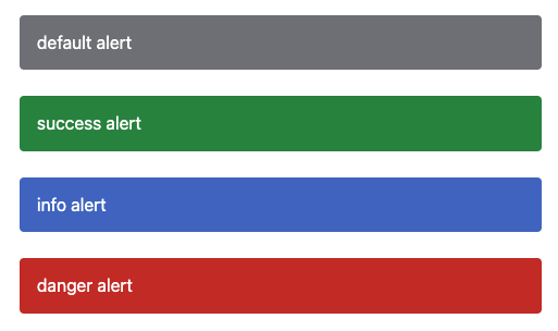
This alert component has several status colors and two size options, default, and compact. We can represent these states via attributes/properties on our component.
<ui-alert>default alert</ui-alert>
<ui-alert status="success">success alert</ui-alert>
<ui-alert status="info">info alert</ui-alert>
<ui-alert status="danger">danger alert</ui-alert>
In our CSS, we can define the default look and feel of our alert. The template for this component is relatively simple, with a single slot to project user content into our template.
<section>
  <slot></slot>
</section>
In the CSS, we style the section element; however, we use CSS Custom Properties for a handful of the styles.
:host {
  --color: #fff;
  --background: #6d6f74;
  --padding: 16px;
  --border-radius: 4px;
  --font-size: 16px;
}

section {
  border-radius: var(--border-radius);
  background: var(--background);
  padding: var(--padding);
  color: var(--color);
  font-size: var(--font-size);
  display: flex;
  align-items: center;
}
The few properties were specifically chosen as they represent the properties that change in our various visual states. We can change these properties based on the element states using the CSS : host selector.
:host([status=info]) {
  --background: #3665c2;
  --color: #fff;
}

:host([status=success]) {
  --background: #298338;
  --color: #fff;
}

:host([status=danger]) {
  --background: #c21919;
  --color: #fff;
}
We can follow the same pattern if we want to add our compact alerts.
<ui-alert size="compact">default alert</ui-alert>
<ui-alert size="compact" status="success">success alert</ui-alert>
<ui-alert size="compact" status="info">info alert</ui-alert>
<ui-alert size="compact" status="danger">danger alert</ui-alert>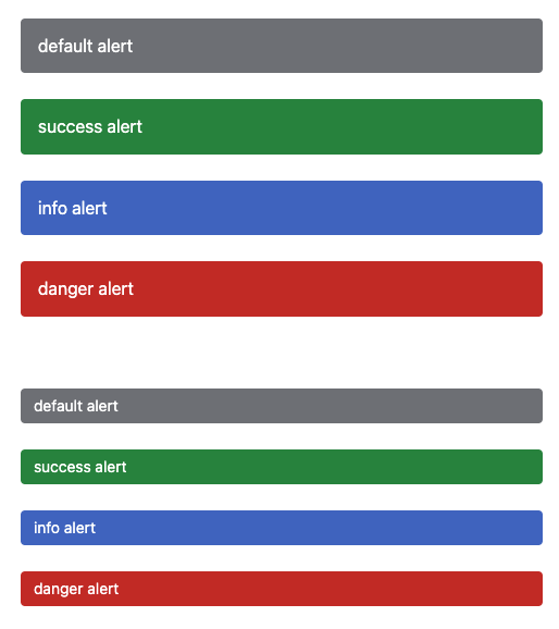
:host([size=compact]) {
  --padding: 8px 12px;
  --font-size: 14px;
}
With this approach, we define the look and feel of our component once. Then leveraging CSS Custom Properties, we "theme" the component for the new visual state.
/* public CSS API */
:host {
  --color: #fff;
  --background: #6d6f74;
  --padding: 16px;
  --border-radius: 4px;
  --font-size: 16px;
}

/* internal element styles */
section {
  border-radius: var(--border-radius);
  background: var(--background);
  padding: var(--padding);
  color: var(--color);
  font-size: var(--font-size);
  display: flex;
  align-items: center;
}

/* element states */
:host([status=info]) {
  --background: #3665c2;
  --color: #fff;
}

:host([status=success]) {
  --background: #298338;
  --color: #fff;
}

:host([status=danger]) {
  --background: #c21919;
  --color: #fff;
}

:host([size=compact]) {
  --padding: 8px 12px;
  --font-size: 14px;
}
With this pattern, we also enable future customizations for consumers. By leveraging the state-based attributes, consumers can create their own custom style states with the same API.
<ui-alert status="promotion">product alert</ui-alert>ui-alert[status=promotion] {
--background: purple;
--color: gray;
}By defining the component's look once, we can ensure easy-to-use style APIs and easy-to-maintain styles within our element. Check out the full demo in the link below!


%20--%3e)
%20--%3e)
