

Reusable UI Components and Data Binding
Cory Rylan
- 4 minutes
This series of posts will cover the various aspects of reusable UI component API design. This series will leverage Web Components for the implementation demos, but the concepts and approaches to API design apply to all UI component frameworks.
In this post, we will dive into API design for UI components when passing data or setting the state of a UI component. First, let's look at an alert component for our example.
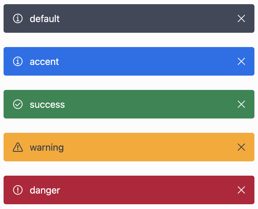
Our alert component has a few different options available. For example, this alert component could have any number of visual states and the option to make the alert box closable.
Properties vs. Attributes
For many web UI frameworks and Web Components, data is passed via HTML attributes or JavaScript properties for generic/reusable components. Depending on the UI environment/tools used, this subtle difference can be abstracted. However, understanding the differences and how they may impact your API decisions is essential.
For Web Components, it's ideal for supporting both HTML attributes and JavaScript properties to set data on your components. Many Web Component authoring tools like lit provide an easy way to keep both the properties and attributes in sync for maximum flexibility and support to your component consumers.
Attributes are set in the HTML directly. Attributes are always string values as its parsed out of the DOM. However, other data types, like numbers, can be passed in as long as your component converts the provided type.
<ui-alert status="success">success</ui-alert>const alert = document.querySelector('ui-alert');
alert.status = 'warning';Properties are set on the DOM object in JavaScript. Many UI frameworks default to setting properties rather than attributes, and most provide a template syntax to explicitly chose how you want to set the component value.
<!-- angular -->
<ui-alert [status]="value">property</ui-alert>
<ui-alert status="success">attribute</ui-alert>

<!-- lit -->
<ui-alert .status="value">property</ui-alert>
<ui-alert status="success">attribute</ui-alert>

<!-- vue -->
<ui-alert :status="value">property</ui-alert>
<ui-alert status="success">attribute</ui-alert>
Data Binding Categories
When defining your components' data inputs, there are three primary categories they fall under.
- Types
status: info | success | error | warning - States
expanded | disabled | selected | collapsed | hidden - Behavior
closable | draggable | sortable
Types typically refer to a visual option defined on a component. A typical example is statuses. For example, the status of our alert defines the visual look and feel.
State goes one step further than just types and describes a component's current state and alters not only the visual aspect but also the initial behavior of the component.
Behavior defines ways to enable behavior features within a component. Example draggable allows the component to support drag and drop functionality.
Impossible States
When designing your component API avoiding "impossible states" can help prevent confusion and entire categories of unexpected behavior or bugs. Let's use our alert component as an example.
<ui-alert success></ui-alert>We could support adding a success attribute/property via our alert, and functionally it would work just fine. However, this introduces a slight risk of misuse.
<ui-alert success warning></ui-alert>With the boolean style attributes/properties for our status, we risk accidentally setting multiple values representing only one type. So rather than using a boolean option, we can use an enum style type.
<ui-alert status="success"></ui-alert>
<ui-alert status="warning"></ui-alert>
<ui-alert status="danger"></ui-alert>
const alert = document.querySelector('ui-alert');
alert.status = 'warning';We lower the risk of overlapping types by leveraging a single status attribute/property.
Boolean Attributes and Properties
For reusable UI components, following the default behavior HTML follows today is optimal. This helps keep the component familiar and easy to use. Boolean attributes can be confusing if not done correctly in component APIs.
<button dissabled>is dissabled</button>
<button hidden>is hidden</button>
<button>not hidden or disabled</button>
By default most HTML element boolean attributes are truthy when applied and only falsy when removed from the element.
<ui-alert closable></ui-alert>const alert = document.querySelector('ui-alert');
alert.closable = true;If you want a particular behavior to be on by default and allow it to be removed, then negate the functionality. However, passing a false string to the attribute still makes the attribute truthy.
<ui-alert closable="false">this is still closable</ui-alert>If our alert is closable by default, we need to adjust our API to follow the boolean attribute behavior and negate the default.
<ui-alert not-closable>this alert cannot be closed</ui-alert>Primitive Types
All JavaScript data types can be used when setting properties on a DOM reference. However, everything is treated as a string when setting data via HTML attributes.
const list = document.querySelector('ui-list');
list.items = [1, 2, 3];
Conversion to strings for primitive types like boolean and number is relatively common and straightforward. HTML elements do this today.
<input type="range" value="5" min="0" max="10" />- attribute/properties:
string | number | boolean - properties only:
object | array
Your UI components can convert complex types like arrays and objects from strings; however, it's very limited and risky as they can have recursive references or methods defined that can't be serialized/de-serialized. In our next follow-up post, we will dig into leveraging declarative content projection for rendering more complex data sets or lists in a highly reusable way. Check out the demo below!


%20--%3e)
%20--%3e)
