

Faster Web Pages with the Picture Element and WebP
Cory Rylan
- 3 minutes
Images can be a significant contributor to page slow down on the Web. Using just a couple of APIs, we can drastically improve the load and render time of a Web page. In this post, we will be using the HTML Picture Element and WebP image compression to better optimize image loading.
WebP Image Format
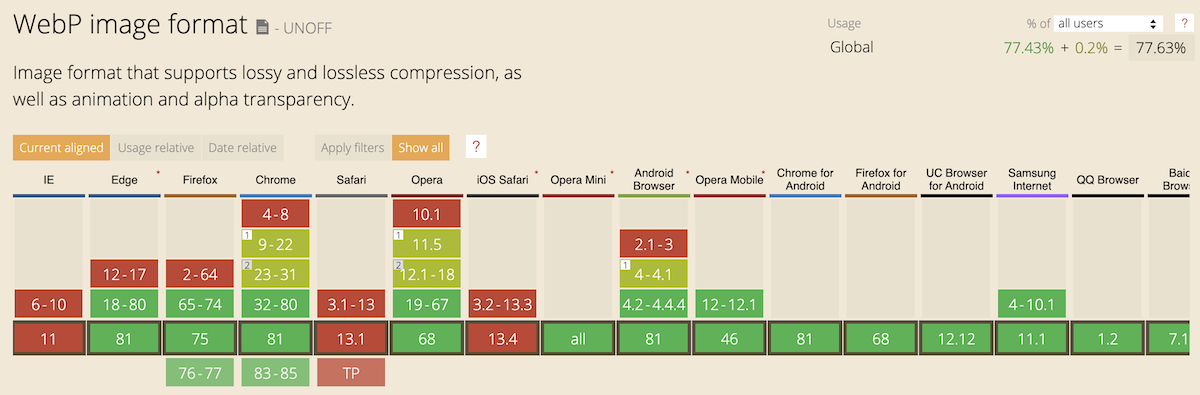
Images on the Web are typically loaded as png, svg, and jpeg formats. With the WebP image format, we can send high-quality images with significant data savings. On average lossless images are about 25% smaller and lossy images upwards of 34% smaller.
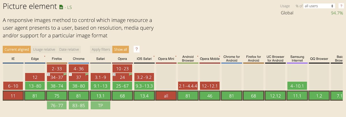
Browser support for WebP is relatively good. While Safari does not yet support WebP, we can still use WebP with the combination of the Picture Element we will cover in the next section.
The easiest way to get started with WebP is to use the cwebp encoder command-line tool. You can find the various installation options here WebP Installation (developers.google.com). Once you have cwebp installed, converting jpg and jpg images is straightforward.
We can pass in an argument of the image we want to convert and the out-file path. Optionally we can control the output quality with the -q flag. By lowering the quality, we compress the image even further.
cwebp -q 90 my-image.jpg -o my-image.webpPicture Element
Now that we can convert our images to a better compression algorithm, how do we support browsers that don't yet support WebP? Using the HTML picture element, we can use fallback image types as well as provide high-resolution images while
preserving performance.
With the picture element, we provide an image tag with an image source that has the most substantial amount of browser support. In this case, it would be a jpg. With the picture tag, we can provide alternative source tags that tell the browser where it can download various formats of the same image. This feature allows the browser to choose what image is ideal base on its capabilities.
<picture>
  <source srcset="/my-image.webp" type="image/webp" />
  <img src="/my-image.jpg" alt:"My Cool Image" loading="lazy" />
</picture>
With the picture element, we can also use the srcset attribute to define high-density images for both our default image and alternative image sources.
<picture>
  <source srcset="/my-image.webp" type="image/webp" />
  <source srcset="/my-image.webp 2x" type="image/webp" />
  <img src="/my-image.jpg" srcset="/my-image.jpg 2x" alt:"My Cool Image" loading="lazy"/>
</picture>
In this example, we can give the browser the source of where to find a 2x resolution version of our image. This feature allows the browser to download whichever image is best for the user based on the device and network capabilities. For example, a high-end laptop on wifi can download the 2x image resources while a mobile device can download the standard resolution.
The browser support for picture is good and due to the syntax browsers that don't support the picture tag ignore the unknown element and load the regular image jpg. Check out the demo below!


%20--%3e)
%20--%3e)