

Design System Performance with Clarity Core Web Components
Cory Rylan
- 12 minutes
Design Systems serve as a foundation for consistent and accessible user interfaces. Components within a design system can also serve as a foundation for the performance of a UI. With [Clarity Core](Clarity Core), our Web Component library, we wanted to ensure we kept components lightweight to continue a high standard of performance as we develop new components.
Creating fast user interfaces on the Web is no easy challenge. The same challenges apply to any UI component library. With the development of Clarity Core, we identified the following key concepts to help keep Clarity's performance on track.
- Dependency Management
- Modern build targets
- Tree shaking (Components, Icons, CSS)
- Bundling and CDNs
- Rendering
- Measuring and Automation
Dependency Management
Excessive JavaScript is one of the largest contributors to slow Web applications today. With Clarity Core, we take careful consideration when using an external dependency.
- Can this be accomplished with something existing in the Web platform today?
- Is this utility tree-shakable and side effect free?
- Can we guarantee it does not change the public API of our components?
- Is the kbs cost worth the value?
Clarity Core uses only a few critical dependencies such as lit-element to make it easy to build and maintain Web Components.
// https://github.com/vmware/clarity/blob/master/packages/core/package.json
{
  "dependencies": {
    "lit-element": "^2.3.1",
    "lit-html": "^1.2.1",
    "ramda": "^0.27.0",
    "tslib": "^2.0.0"
  },
  "optionalDependencies": {
    "@clr/city": "^1.1.0",
    "@webcomponents/shadycss": "^1.10.1",
    "@webcomponents/custom-elements": "^1.4.2",
    "@webcomponents/webcomponentsjs": "^2.4.4",
    "css-vars-ponyfill": "^2.3.2",
    "normalize.css": "^8.0.1"
  }
}
The direct dependencies are all internal in Core and not exposed in any public API. By keeping dependencies internal, we can help ensure long term stability with the component APIs. The optionalDependencies allow applications to choose if a particular dependency needs to be installed. Keeping polyfills an optionalDependency teams can conditionally load them as needed for their target browser support.
Modern Build Targets
For Clarity Core, we ship the latest es2015+ JavaScript code. Core does not ship ES5 or UMD style bundles. This choice is for maintainability and performance. By shipping modern JavaScript as the default, we can significantly reduce the amount of code sent to the client. By providing a modern JavaScript source, applications start with the lightest option and can optionally downgrade to ES5 for older browser support. This strategy gets us the broadest amount of tooling support in the JavaScript ecosystem.
For applications that need to target ES5 browsers, the code can be consumed and transpiled with Babel or TypeScript. Many framework tools like the [Angular CLI have this ability built right in](Angular CLI have this ability built right in).
To learn more about the details of packaging Web Components, I highly recommend these two articles:
- https://open-wc.org/publishing/
- https://justinfagnani.com/2019/11/01/how-to-publish-web-components-to-npm/
Tree Shaking Web Components
Tree shaking is a concept where a build process removes unused code from a final build output. When using a comprehensive design system like Clarity, you may only use a subset of its components. When this happens, we want only the used components end up in your final output shipped to the client. Removing or tree shaking this unused code can significantly improve the startup time of an application.
To promote tree shaking, we have organized Core to have multiple entry points. Multiple entry points mean there is more than one starting location to import from in a package. Example, a single entry point library may look like the following:
import { CdsButton, CdsModal } from '@clr/core';In many cases, this works; however, if we split this into smaller entry points, we can help promote patterns that will improve tree-shaking.
import { CdsButton } from '@clr/core/button';
import { CdsModal } from '@clr/core/modal';
Each component has its own entry point enforcing a hard and clear boundary between components. This boundary helps prevent accidental bundling situations since the components are not referred to in the same entry point file.
If there is code we need to share between component boundaries, we move it to our internal @clr/core/internal package. This entry point allows us to safely share internal code between component boundaries and encourage code de-duplication at build time.
Side Effects
Many libraries and even some applications will have a sideEffects key defined within their package.json.
{
  "version": "0.0.0",
  "sideEffects": false
}
This flag signals bundlers like Webpack and Rollup only to keep code that is exported and used within other modules. This optimization can further reduce the overall bundle size of your applications. However, JavaScript modules natively support side effects. So what is a side effect? A side effect is produced whenever a piece of JavaScript code executes and changes state outside of the executed function. Let's take a look at this example:
const value = 'hello there';
console.log(value);

export function add(val, val2) {
  return val + val2;
}

export function sub(val, val2) {
  return val - val2;
}
This file, we have a variable statement, a console log, and two exported functions. With the sideEffects: false flag a bundler will bundle the add() and sub() functions if used in another module. However, the console log and variable will be removed from the final build output. The log and variable are side-effects or code that do work outside the scope of being statically exported.
With side effects set to false, the bundlers must assume the default JavaScript behavior and include everything in the file/module. That means if you only use the add() function in your application, the bundler will still include sub().
With our Web Components, we want the optimal performance, but there is a bit of a wrinkle in our sideEffects: false plan. We have to register our components to the custom elements registry to use the in the DOM. The act of registering a component is a side effect, so if we use sideEffects: false in them, our components will never be registered.
So how do we get around this? We move the side effects into a single register.js file.
// https://github.com/vmware/clarity/blob/master/packages/core/src/button/register.ts
import { CdsButton } from './button.element.js';

customElements.define('cds-button', CdsButton);
By moving the side effect of registering our Web Component, we allow the rest of the library to be fully tree shakable and side effect free. We can tell bundlers that we have only one specific side effect file in our package.json.
// https://github.com/vmware/clarity/blob/master/packages/core/src/button/package.json
{
  "name": "@clr/core/button",
  "main": "./index.js",
  "module": "./index.js",
  "typings": "./index.d.ts",
  "type": "module",
  "sideEffects": [
    "./register.js"
  ]
}
Now, as a user of Clarity, you can import the registration statement to use the component and still get advanced tree shaking capabilities.
import '@clr/core/button/register.js';Tree Shaking Icons
With Clarity Core, we have extensive strategies in place to ensure your final build only includes the components that you use. We can take it one step further and tree shake at the symbol level.
A symbol is anything imported through an import statement. Most build tools like Webpack and Rollup rely on import statements to safely determine what code can or should not be bundled.
By relying on this behavior, we can improve our icons API to promote tree shaking. With almost 500 icons, we want only the icons you use to make it to the final application build. Including all icons would cause users to download hundreds of kb of embedded SVG in your application. By supporting tree shaking at the icon level, performance can improve as less JavaScript is needed to be parsed on application startup.
import { ClarityIcons, searchIcon, userIcon } from '@clr/core/icon';
import '@clr/core/icon/register.js'; // use the icon component

ClarityIcons.addIcons(searchIcon, userIcon); // define which icons needed
By leaning on the side effect free behavior we discussed earlier, a bundler can safely assume only the ClarityIcons service and two icons are used. This explicit import of the icons used within your application allows Webpack or Rollup to safely drop the other 400+ icons from the final production bundle saving hundreds of kbs of JavaScript from having to be sent to the client.
You can start using Core Icons today within your existing applications, even if you currently use the @clr/icons package.
Bundles and CDNs
Along with shipping modern, side effect free JavaScript, we do not bundle or minify the source code. This may seem counter-intuitive at first but bundling and minification are application concerns. These optimizations work better at application-level tooling as these tools can understand all dependencies of the entire application.
Bundling code at the library level can cause dependencies to become difficult to tree shake or de-duplicate in the final build. By keeping everything as plain modern ESM, most bundlers can better optimize your usage of library code.
By not bundling, we also open the door for the first time to support build-less versions of Clarity. When we keep the source unbundled, we can use native ES modules via a CDN. Using native ESM, the browser can natively load only the modules required with no bundler or build step.
<!doctype html>
<html lang="en">
<head>
  <title>Clarity Design System</title>
  <meta name="viewport" content="width=device-width, initial-scale=1">
  <link rel="stylesheet" href="https://unpkg.com/normalize.css/normalize.css">
  <link rel="stylesheet" href="https://unpkg.com/@clr/core@next/global.min.css">
  <link rel="stylesheet" href="https://unpkg.com/@clr/city/css/bundles/default.min.css">
</head>
<body>
  <cds-badge status="success">4.0.0</cds-badge>
  <script type="module" src="https://unpkg.com/@clr/core@next/badge/register.js?module"></script>
</body>
</html>
Prototyping with Clarity has never been easier with CDN support. Check out https://skypack.dev/ or https://unpkg.com/ for more details on ESM support.
Global and Utility CSS
Another significant performance improvement with Clarity Core is our global CSS payload size. Component CSS is inlined within the component. This means that, if you use the button component, the button component CSS is included within the JavaScript. This allows us to significantly reduce the amount of global CSS needed.
To use the global CSS in Clarity Core, you can import the global file.
@import '~normalize.css/normalize.css';       // standard browser style reset
@import '~@clr/core/global.min';              // clarity global styles
@import '~@clr/city/css/bundles/default.min'; // clarity font stylesheet
The global stylesheet provides a basic Clarity specific reset, CSS Custom Variables, layout utilities, and typography utilities. Together these total to a final bundled, minified, and compressed output of ~7kb.
If you only want a subset of these utilities, you can import them directly instead of importing the single global bundle. This lets you pick and choose what you need - resulting in even smaller bundles. We do, however, recommend including the normalize and reset styles at a minimum.
@import '@clr/core/styles/module.reset.min.css';
@import '@clr/core/styles/module.tokens.min.css';
@import '@clr/core/styles/module.layout.min.css';
@import '@clr/core/styles/module.typography.min.css';
Our layout and typography utilities cover many use cases. This causes the initial global CSS bundle to come in around 177kb uncompressed and unminified. But the repetitive nature of the utility selectors allows us to leverage text compression behavior.
Compression tools like Gzip and Brotli heavily optimize for repetitive text. Because of this behavior, we compile our utility CSS in an order that places similar selectors next to each other in the final output. This enables a 177kb CSS file to be ~7kb with minification and Brotli compression or 10kb with Gzip compression.
With some tweaks to our CSS output, we can shrink our CSS significantly with text compression. But even though we have a small network payload, we still are sending a lot of potentially unused CSS.
Tree Shaking CSS
The provided global CSS utilities are also used internally within our Web Components. The Core CSS utilities are extensive and we may only use a small subset of the utilities provided within any given component. We can optimize for this by ensuring only the utilities we use are bundled within our Web Components.
For this, we use a tool called Purge CSS that ensures we only bundle CSS utilities which are used within the component. We run Purge CSS as part of the build process and it tree shakes our CSS within our internal templates.
For example, if our button only uses a couple of the CSS utilities, we don't want the 7kb+ of CSS bundled with it nor bundled multiple times for each component. By running Purge CSS, we can check what is used within our component templates and strip out any unused CSS. Here is a snippet demonstrating how we tree shake the CSS in our components.
// https://github.com/vmware/clarity/blob/master/packages/core/package-css.js
async function treeshakeCommonCSS() {
  const css = fs.readFileSync('./base.element.css', 'utf8');

  const purgeCSSResult = await new PurgeCSS().purge({
    // Compare component templates to CSS to find CSS selectors to keep
    content: ['./src/**/*.element.ts'],
    // Custom extractor helps match against our responsive attribute utils
    defaultExtractor: content => content.match(/[\w-\/:@]+(?<!:)/g) || [],
    whitelistPatterns: [/:host$/],
    css: [{ raw: css }],
    variables: true, // Optimize for CSS Custom Properties
  });

  fs.writeFileSync('./base.element.css', purgeCSSResult[0].css);
}

treeshakeCommonCSS();
By tree shaking the CSS used internally by Core components, we further drive down the bundle sizes. While we use Purge CSS at the library level, you can also use it on your applications to reduce your CSS payload. The less CSS that is sent down the wire, the faster the browser can start rendering the page.
Rendering
With our components using Shadow DOM, we can guarantee a certain amount of containment with CSS layout and behavior. External styles don't leak into our component, and our component styles don't leak to the global scope. With this behavior, we can optimize the browser rendering by using the CSS contain property.
:host {
  contain: content;
}
Using the contain property, we tell the browser this element is self-contained and can optimize when to render and re-render it. This can significantly reduce render times on the page as the browser can skip layout recalculations. To dig into this topic, check out the Google Developer Docs on CSS Contain.
Now that we have identified all the different strategies to keep Core running at optimal performance, how do we stay on track and prevent performance regressions?
Measure and Automate
We run a check against our final build output for final payload sizes with each build in our CI process. We use bundle-size, which can check what our final file sizes are compressed.
The bundle-size tool takes a config with maximum sizes for given files. If a file exceeds that size, then the build will fail. This helps catch mistakes that would cause unexpected size increases or issues that would break tree shaking.
Here is a sample of what our config looks like:
// https://github.com/vmware/clarity/tree/master/packages/core/test-bundles
{
  "files": [
    {
      "path": "./dist/core/global.min.css",
      "maxSize": "7 kB",
      "compression": "brotli"
    },
    {
      "path": "./dist/test-bundles/webpack.bundle.js",
      "maxSize": "18.5 kB",
      "compression": "brotli"
    }
  ]
}
We have a small Webpack build that runs against a single JavaScript file to catch tree shaking regressions.
import '@clr/core/badge/register.js';
import '@clr/core/icon/register.js';
import { ClarityIcons, userIcon } from '@clr/core/icon';

ClarityIcons.addIcons(userIcon);
This simple file will allow us to test that Webpack can successfully import our two components and icon without bundling any other components or icons. This tests that we are successfully tree shaking at the component level and symbol import level.
We benchmark our bundle sizes against Brotli Compression rather than gzip. Brotli is a modern compression format and provides significant improvements over gzip. Most web services and CDNs now support Brotli automatically and it is widely supported in browsers.
Results
With all these optimizations in place, we can create a hello world Clarity app consisting of only 17kb of JavaScript and 8kb of CSS with a basic Webpack build. This demo app includes two components: the badge and icon component and two icon shapes. The CSS is our standard global bundle and the normalize.css package.
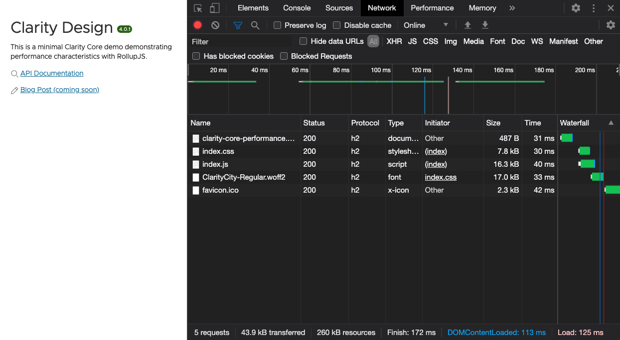
While this is lightweight, we can do more. We are only using a fraction of the CSS utilities in this simple demo. Using Rollup, we can push the performance even further in our application with just a few adjustments.
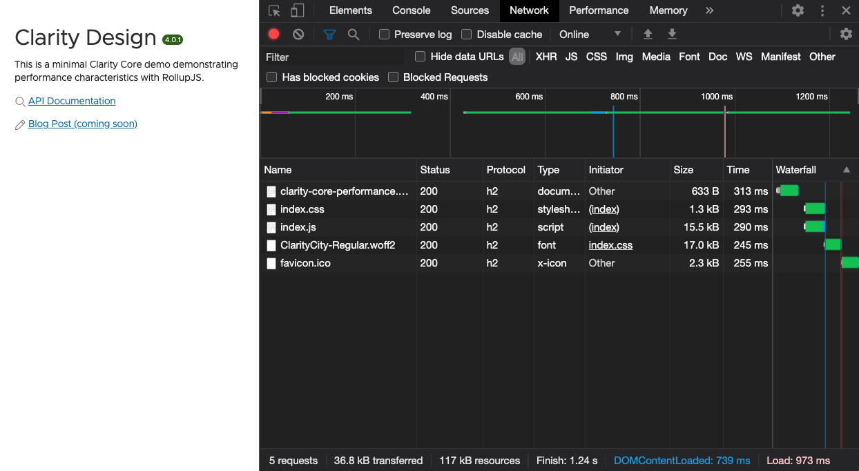
With Rollup, we can provide a couple of lit-element specific optimizations for our application build. This includes dropping polyfills and minifying our templates.
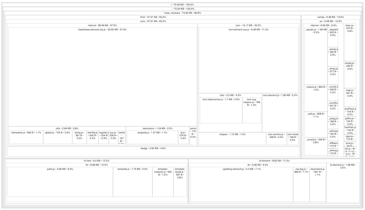
With both component and icon tree shaking, we can use the Source Map Explorer tool to verify we are only loading the code we use and our dependencies in our final bundle.
Using PurgeCSS, we can tree shake our unused Global CSS. This pulls our hello world Clarity app down to around 1kb of compressed CSS and around 15kb of compressed JavaScript! While simple, this demo demonstrates the optimizations made possible by component, icon, and CSS tree shaking.
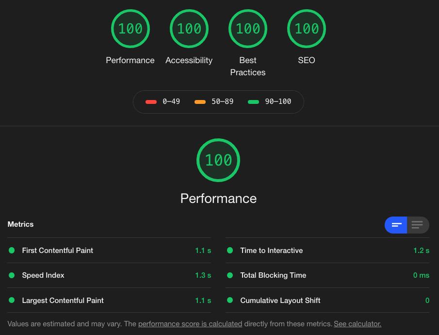
With such a light payload, we get an initial render of around 1 second on a simulated 3g connection. Take time to check out the running demo application and the source code. You can find more demos in various frameworks in the Clarity Core repository on Github.


%20--%3e)
%20--%3e)
'%3e%3cpath%20d='m222.077%2039.192-8.019%20125.923-76.671-165.115zm-53.105%20162.825-57.933%2033.056-57.934-33.056%2011.783-28.556h92.301zm-57.933-139.342%2030.357%2073.803h-60.715zm-103.102%20102.44-7.937-125.923%2084.69-39.192z'%20fill='url(%23a)'/%3e%3cpath%20d='m222.077%2039.192-8.019%20125.923-76.671-165.115zm-53.105%20162.825-57.933%2033.056-57.934-33.056%2011.783-28.556h92.301zm-57.933-139.342%2030.357%2073.803h-60.715zm-103.102%20102.44-7.937-125.923%2084.69-39.192z'%20fill='url(%23b)'/%3e%3c/g%3e%3c/svg%3e)