CSS Container Queries in Web Components
Cory Rylan
- 3 minutes
CSS Container Queries provide a powerful way to apply styles based on the size of a component's container, rather than just the size of the viewport. This allows for more modular, responsive, and reusable components. In this blog post, we will explore how to use CSS Container Queries in Web Components by examining a code example and understanding its different parts.
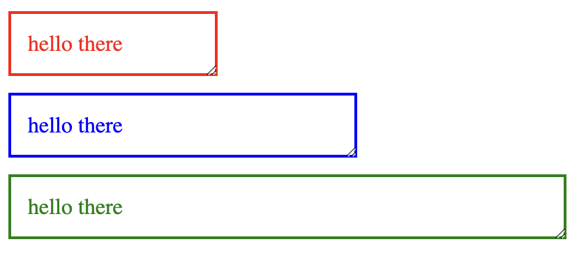
Our example component will adjust its text and border color based on its current size.

Creating a Web Component
First, let's examine the JavaScript code for creating the Web Component:
const template = document.createElement('template');
template.innerHTML = `
  ...
`;

class Element extends HTMLElement {
  constructor() {
    super();
    this.attachShadow({ mode: 'open' });
    this.shadowRoot.appendChild(template.content.cloneNode(true));
  }
}

customElements.define('ui-element', Element);
In this code snippet, we create a new HTML template element and set its innerHTML property with the desired styles and markup. We then define a new custom element called ui-element by extending the HTMLElement class. In the constructor, we attach a shadow root and clone the contents of the template into it. Finally, we register the custom element using customElements.define.
Defining the Styles
Now let's take a closer look at the styles in the template:
:host {
  display: block;
  container-type: inline-size;
}

p {
  --color: red;
  color: var(--color);
  border: 2px solid var(--color);
  padding: 12px;
  margin: 0;
}
The :host selector targets the custom element itself. We set its display to block, add a margin to separate it from other elements, and enable inline resizing. We also set the container-type property to inline-size, which is required for container queries to work. The container-type sets the appropriate container type for the container query. This can be along the block or inline axis.
We define a paragraph style with a custom property --color, which is later used for both the text color and border color. Initially, the color is set to red.
Applying Container Queries
Now, let's look at the container queries themselves:
@container (min-width: 200px) {
  p {
    --color: blue;
  }
}

@container (min-width: 400px) {
  p {
    --color: green;
  }
}
We use the @container at-rule to apply styles based on the container's width. When the container's width is at least 200 pixels, we change the color to blue, and when it's at least 400 pixels, we change it to green. These styles will be applied to the paragraph element inside the component.
Using the Web Component
Lastly, let's look at how to use the Web Component in our HTML code:
<ui-element style="width: 150px">hello there</ui-element>
<ui-element style="width: 250px">hello there</ui-element>
<ui-element style="width: 400px">hello there</ui-element>
We create three instances of the ui-element component, each with different widths. The container query styles will be applied based on the width of each component, resulting in different colors for each instance.
We learned how to use CSS Container Queries in Web Components to create responsive and reusable components. Container queries enable developers to apply styles based on the size of a component's container, making it easier to create modular and adaptable designs. Check out the full working demo below!

