

Create your first Web Component with Stencil JS
In this post we are going to cover a exciting new technology called
Stencil JS. Stencil is a Web Component compiler that allows us to author native Web Components with ease. In this post, we are going to create our first Web Component with the Stencil tooling and cover the basics of how Web Components work. This post assumes a basic knowledge of JavaScript, Git, and NPM.
Why Web Components?
By creating our UI components with Web Components instead of Framework specific components like React or Angular we can reuse these components in any framework that supports them or all on their own. Web components are a component model that we are familiar with in other frameworks but now supported natively in browsers.
If you have used React, Angular, Ember or Vue components, then you will feel very comfortable with Web Components. Except for React, all modern web frameworks work seamlessly with Web Components. Web Components allows us to share our code on different code bases with different frameworks.
Web Components API
Web Components are custom HTML elements we can use in our HTML views. Web Components are composed of a few different APIs, but we are going to focus on the essential core APIs.
Web components at the most basic level are a custom HTML element ex: <my-dropdown><my-dropdown>. In our example, we are going to make a simple dropdown component like this.
Our dropdown component when used in our HTML templates will look something like the following:
<my-dropdown title="Toggle">
  Hello World
</my-dropdown>
Our drop-down component takes two different pieces of data. First, the title property which allows us to set the button title in the component. Second is the Hello World string in between the my-dropdown component tags. The drop-down component template will wrap this content.
Stencil JS is not another JavaScript Framework or Library. Stencil aims to be a Web Component Compiler. Stencil gives us the tools to write Web Components with excellent development tools such as TypeScript and JSX but compiles down to vanilla Web Components for any framework to use. Let's take a look at a fundamental Stencil component.
Stencil JS Getting Started
To get started we can clone the starter Stencil app repository from GitHub.
/*
  Starting a new project

  git clone https://github.com/ionic-team/stencil-starter.git my-app
  cd my-app
  git remote rm origin
  npm install
  npm start
*/
Once installed and started we will see the message Hello, my name is Stencil JS. This starter app sets up the Stencil compiler and a small project to start writing our components. The project starts off with a single component called my-name. If we look in the index.html we will see the following:
<my-name first="Stencil" last="JS"></my-name>Our first Stencil component has two input properties that allow us to pass data for the component to display. Now let's take a look at the code for this component.
import { Component, Prop } from '@stencil/core';

@Component({
  tag: 'my-name',
  styleUrl: 'my-name.scss'
})
export class MyName {
  @Prop() first: string;
  @Prop() last: string;

  render() {
    return (
      <p>
        Hello, my name is {this.first} {this.last}
      </p>
    );
  }
}
If you have used Angular, this code will look very familiar. Stencil uses Decorators to describe how the component should work.
import { Component, Prop } from '@stencil/core';

@Component({
  tag: 'my-name',
  styleUrl: 'my-name.scss'
})
...
We import the decorators from the Stencil package. The component decorator describes some basic information. The tag value is the HTML element that the component will use. Stencil also supports Sass and CSS for our components, so its simple to style out of the box. Next is the component class.
export class MyName {
  @Prop() first: string;
  @Prop() last: string;

  render() {
    return (
      <p>
        Hello, my name is {this.first} {this.last}
      </p>
    );
  }
}
Web components can pass data to child components via custom properties. Stencil uses a @Prop() decorator to know what properties can be set by other components. We have two props first and last. We can now pass data into this component like so:
<my-name first="Stencil" last="JS"></my-name>Next is the render method on our component. The render method is called whenever a prop is updated, and the HTML should update from the new data. Stencil uses JSX
for its templating like ReactJS. JSX is an XML like syntax that allows us to easily create templates with JavaScript constructs.
  render() {
    return (
      <p>
        Hello, my name is {this.first} {this.last}
      </p>
    );
  }
Now that we have the basics lets create our custom Web Component with Stencil.
Custom Web Component with Stencil JS
We will be making the drop-down component that we mentioned at the beginning of the article.
In our existing Stencil project, we cloned we are going to add a new directory named dropdown and adding two new files dropdown.tsx and dropdown.scss. Taking a look at our component lets add some basic markup to our dropdown. We will also add a prop to allow the user of our component to set the button title.
import { Component, Prop } from '@stencil/core';

@Component({
  tag: 'my-dropdown',
  styleUrl: 'dropdown.scss'
})
export class Dropdown {
  @Prop() title: string = '';

  render() {
    return (
      <div>
        <button>
          {this.title}
        </button>

        <div>
          <slot></slot>
        </div>
      </div>
    )
  }
}
Notice we display the title property in our button but more importantly the <slot> element in the template. The slot element allows stencil to place any content in the drop-down tags to be wrapped by the component template.
<my-dropdown title="Toggle">
  Hello World
</my-dropdown>
As we can see our title will be "Toggle" and the content displayed will be transferred from inside the my-dropdown tag to the template of the component. This will make it easy to show and hide the content as we will see next.
Component State
We now need to track the state of whether or not the content should be visible or hidden. To do this, we set a property and a special @State() decorator. This notifies Stencil that the property can change and it should update the view whenever that property changes. We also use JSX to apply CSS to show or hide based on this state in the component.
import { Component, Prop, State } from '@stencil/core';
@Component({
tag: 'my-dropdown',
styleUrl: 'dropdown.scss'
})
export class Dropdown {
@Prop() title: string = '';
// Data/state that can change in the component should use the state decorator
@State() toggle: boolean = false;
render() {
return (
<div>
<button onClick={() => this.toggleClick()}>
{this.title} {this.toggle ? <span>▲</span> : <span>▼</span>}
</button>
<div style={{ display: this.toggle ? 'block' : 'none' }}>
<slot></slot>
</div>
</div>
)
}
// When clicked invert the state of the toggle property
toggleClick() {
this.toggle = !this.toggle;
}
}
Component Events
Components can pass data down to child elements. Child components can also notify parent components of changes. For example, we would like the drop-down component to inform us when the user toggles the drop-down.
To accomplish communicating with events there are two parts. The first is our dropdown emitting a custom event. The second is our parent component using the drop-down listening for that event.
To emit custom events, we use the @Event() decorator and EventEmitter class.
import { Component, Event, EventEmitter, Prop, State } from '@stencil/core';
@Component({
tag: 'my-dropdown',
styleUrl: 'dropdown.scss'
})
export class Dropdown {
@Prop() title: string = '';
@State() toggle: boolean = false;
// our custom event for other components to listen to
@Event() onToggle: EventEmitter;
render() {
return (
<div>
<button onClick={() => this.toggleClick()}>
{this.title} {this.toggle ? <span>▲</span> : <span>▼</span>}
</button>
<div style={{ display: this.toggle ? 'block' : 'none' }}>
<slot></slot>
</div>
</div>
)
}
toggleClick() {
this.toggle = !this.toggle;
// When the user click emit the toggle state value
// A event can emit any type of value
this.onToggle.emit({ visible: this.toggle });
}
}
Now that the component is emitting events when the user toggles the element how do we listen to those events? In our parent my-name component we are going to add a method and use a new decorator called @Listen().
import { Component, Prop, Listen } from '@stencil/core';

@Component({
  tag: 'my-name',
  styleUrl: 'my-name.scss'
})
export class MyName {
  ...
  render() {
    ...
  }

  @Listen('onToggle') // Listen to the onToggle event from the dropdown component
  log(event) {
    console.log(event);
  }
}
Any time the onToggle event fires our log method will be called and passed the event value where we simply log it to the console.
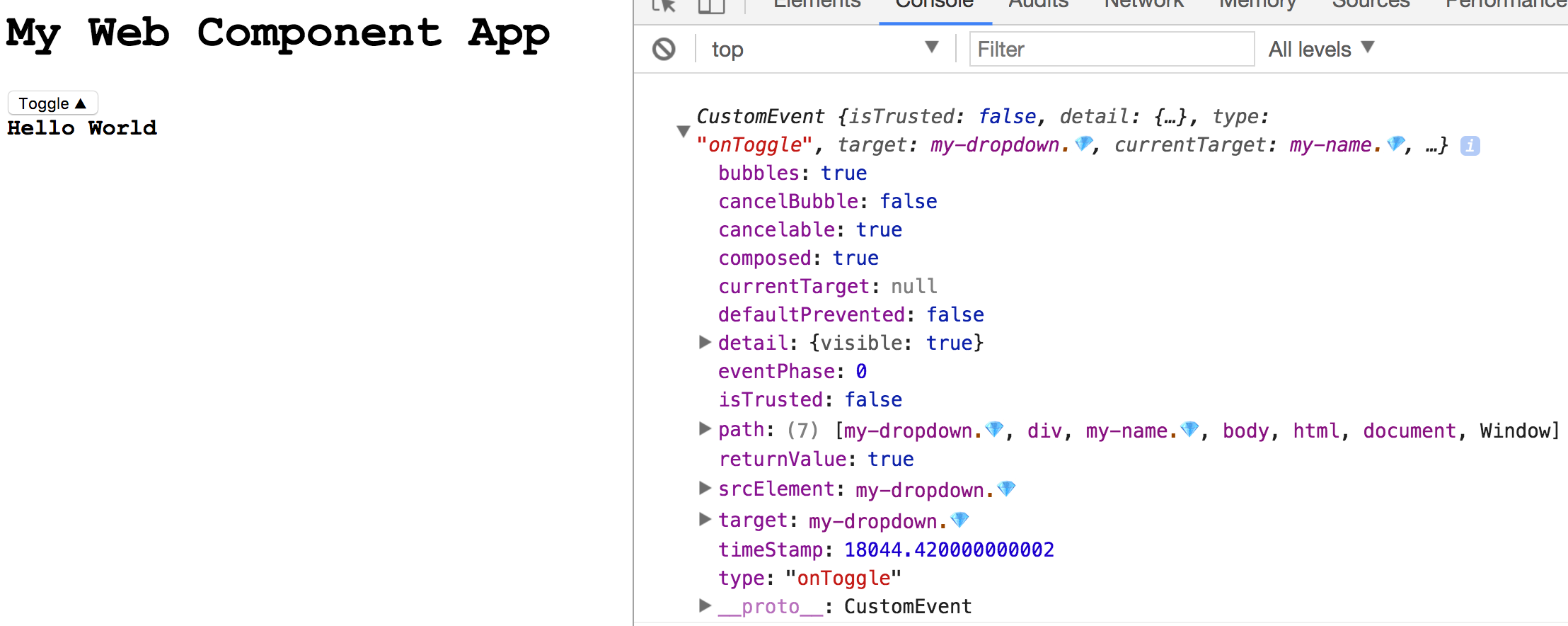
The event contains information about the component that emitted the event as well as the event value under the detail property.
Stencil is still in the early alpha stages at the time of this writing, but it's exhilarating to see where the web is going. The ability to share components between frameworks will change how we build for the web. In later posts, I'll cover how to package your stencil components to be used in other frameworks like Angular and Vue. Check out the demo below!


%20--%3e)
%20--%3e)
