

Don't Override CSS Outline Focus Styles
Cory Rylan
- 4 minutes
It's common to see websites remove the focus outline of focusable items. Removing outline styles, however, causes problems for many users. To keep your websites and web apps accessible focusable items must have a focus outline. Users with mobility disabilities may only be able to use a keyboard or non-mouse interaction with your web app. By removing the outline, your web app can quickly become unusable.
button {
  outline: 0; /* don't do this! */
}
Many developers and designers do not like the default system focus most browsers provide and often override it with a custom outline style.
button:focus {
  outline: 4px solid blue;
}
Custom outlines can introduce a new set of usability problems that we will cover in this post. First, let's look at a set of blue buttons for our demo.
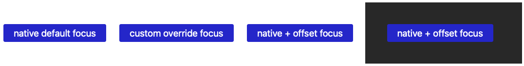
These are native HTML buttons with some minor style changes for the background color. These buttons can have some issues when focused. The focus outline can blend into the button, making it difficult to see.
Chrome Focus Styles
This screenshot is an example running in Chrome. Each button is focused in the screenshot, and each looks slightly different. The first button is the default focus style in Chrome. We can see it blends in with the button. The second button shows a custom style that makes the outline larger but still blends in. We could change the color but will have to maintain multiple colors for each button color we may provide.
The last two buttons have native focus styles with some offset adjustments. As of Chrome 83 (announcement here), the focus styles have changed as well as the latest Edge. The new native focus style has two borders a light and dark that can be seen and altered by the browser-based on the background color. This feature is great to help ensure the focus is visible regardless of the surrounding colors.
But there is still a slight problem with this approach. The outline is directly next to our first button, making it difficult to see if the colors are similar. Some browsers mitigate this. For example, Safari adds an offset space between the button and the outline automatically.
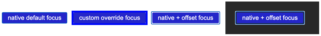
Safari Focus Styles
As you can see, the offset Safari provides makes the focus much more visible. Unfortunately, Safari is currently the only browser that provides this default offset spacing. As we can see in Edge and Firefox, the first two buttons in each have no default offset.
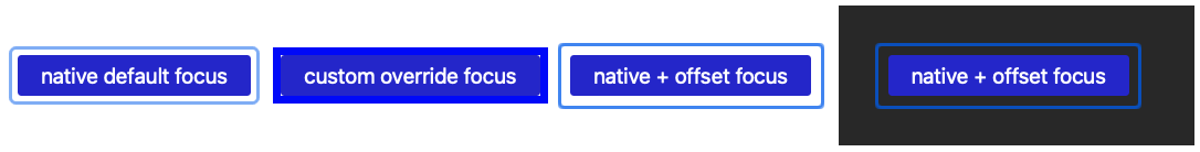
Edge Focus Styles

Firefox Focus Styles
Even though only Safari provides an offset, we can still adjust the CSS outline offset ourselves.
button {
  outline-offset: 2px;
}
The outline-offset CSS property will add space between the element and the focus outline, making a visual distinction. But again, we run into some browser compatibility problems.
Offset Outline with Native Defaults
In Chrome and Edge, the outline-offset property does not work on the default outline style. The outline-offset will work only on custom outline styles. We don't want to override the default outline since Chrome and Edge provide the helpful multi background outline support for accessibility.
So what can we do to improve this? We don't want to override the native behavior as it provides the best accessibility support, but we cant apply the outline-offset needed. We can use a trick to create a pseudo-element around our focusable item that is slightly larger to create an offset space.
button {
  /* for browsers that support native offset without custom outline */
  outline-offset: 2px;
}

button:focus {
  position: relative;
}

button:focus::after {
  content: '';
  position: absolute;
  top: -2px;
  left: -2px;
  right: -2px;
  bottom: -2px;
  outline: 5px auto -webkit-focus-ring-color;
}
When the button is focused, we can create a pseudo-element and position it slightly larger, about two pixels, and around the focused button. To apply the native focus style to the pseudo-element, we use this CSS property:
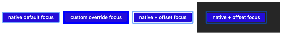
outline: 5px auto -webkit-focus-ring-color;This CSS line is the CSS that triggers the internal native outline style in Chrome and Edge, which will preserve the multi background color support. Looking back at our examples, the last two buttons have the space between the button and the outline. Since we did not override the native outline style, the outline is automatically visible on light and dark backgrounds.
Chrome Focus Styles
Accessibility can be tricky to get right across several browsers. Often browsers built-in defaults provide a solid foundation and are always improving. When adding custom overrides, we remove the browser's chance to provide better defaults in the future. As Web Developers, we must find that balance between customization and using what is built-in. Check out the full demo code below!


%20--%3e)
%20--%3e)
'%20points='107.644,470.877%2074.633,100.62%20437.367,100.62%20404.321,470.819%20255.778,512'/%3e%3cpolygon%20fill='hsl(18,%2086%25,%2055%25)'%20points='256,480.523%20376.03,447.246%20404.27,130.894%20256,130.894'/%3e%3cg%3e%3cpolygon%20fill='%23EBEBEB'%20points='256,268.217%20195.91,268.217%20191.76,221.716%20256,221.716%20256,176.305%20255.843,176.305%20142.132,176.305%20143.219,188.488%20154.38,313.627%20256,313.627'/%3e%3cpolygon%20fill='%23EBEBEB'%20points='256,386.153%20255.801,386.206%20205.227,372.55%20201.994,336.333%20177.419,336.333%20156.409,336.333%20162.771,407.634%20255.791,433.457%20256,433.399'/%3e%3c/g%3e%3cg%3e%3cpath%20d='M108.382,0h23.077v22.8h21.11V0h23.078v69.044H152.57v-23.12h-21.11v23.12h-23.077V0z'/%3e%3cpath%20d='M205.994,22.896h-20.316V0h63.72v22.896h-20.325v46.148h-23.078V22.896z'/%3e%3cpath%20d='M259.511,0h24.063l14.802,24.26L313.163,0h24.072v69.044h-22.982V34.822l-15.877,24.549h-0.397l-15.888-24.549v34.222%20h-22.58V0z'/%3e%3cpath%20d='M348.72,0h23.084v46.222h32.453v22.822H348.72V0z'/%3e%3c/g%3e%3cg%3e%3cpolygon%20fill='%23FFFFFF'%20points='255.843,268.217%20255.843,313.627%20311.761,313.627%20306.49,372.521%20255.843,386.191%20255.843,433.435%20348.937,407.634%20349.62,399.962%20360.291,280.411%20361.399,268.217%20349.162,268.217'/%3e%3cpolygon%20fill='%23FFFFFF'%20points='255.843,176.305%20255.843,204.509%20255.843,221.605%20255.843,221.716%20365.385,221.716%20365.385,221.716%20365.531,221.716%20366.442,211.509%20368.511,188.488%20369.597,176.305'/%3e%3c/g%3e%3c/g%3e%3c/g%3e%3c/switch%3e%3c/svg%3e)